Preview image. Unlock full-res
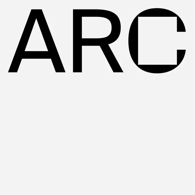
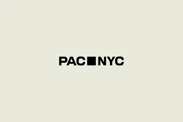
A geometric wordmark for PAC NYC where a solid square replaces the N, creating a minimalist, memorable identity through a single striking element.
Summary
A geometric wordmark for PAC NYC where a solid square replaces the N, creating a minimalist, memorable identity through a single striking element.
Visual description
The wordmark "PAC NYC" appears in a heavy, modern sans-serif with uniform weight and spacing. The N is replaced by a black filled square, positioned at the same baseline as the letters. The composition sits centered on a warm beige background. The contrast between the stark black typography and the off-white field creates immediate visual impact while maintaining legibility.
Key takeaway
The conceptual economy of substituting a single letterform with a geometric shape: it solves the wordmark challenge with one move, creates instant visual recognition, and reduces the identity to its essence. The tonal restraint (black and beige only) enforces visual clarity.
Reuse notes
Effective for institutional brands, tech companies, or any identity that needs geometric rigor and memorability. The approach works best when the substitution feels inevitable, not decorative. Requires confident letterspacing and weight to land the effect.