Preview image. Unlock full-res
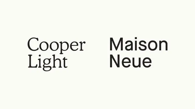
Minimal side-by-side type specimen contrasting two foundational typefaces: a serif-inflected light face against a geometric sans-serif display weight.
Summary
A refined type pairing study showing Cooper Light (serif-influenced light) and Maison Neue (geometric sans-serif) as complementary display typefaces for editorial and branding work.
Visual description
Cream background with black text. Two typeface names set in their own fonts, positioned symmetrically side-by-side: "Cooper Light" on the left in a lighter serif-influenced face, "Maison Neue" on the right in a bold geometric sans-serif. Clean, minimal layout with no additional elements. Generous whitespace dominates. Both typefaces appear at the same size for direct visual comparison. The pairing demonstrates contrast in weight (light vs bold), structure (serif-influenced vs geometric), and character personality (refined vs contemporary).
Key takeaway
Symmetric side-by-side specimen layout that lets two typefaces speak for themselves without commentary. The light-weight serif paired against geometric sans creates visual friction that highlights each family's strengths. Minimal specimen presentation—no dummy text, no metadata, just the names set in themselves—is confidence-forward and educational.
Reuse notes
Ideal for foundry presentations, design education materials, and type-focused brand systems. The pairing works well for luxury editorial, contemporary branding, or any project that blends refined serif sensibility with modern geometric shapes. This specimen format scales to other font comparisons and pairs.
More like this





Keep what you find
A free account saves references to boards and can send you a weekly email of picks based on what you save.
To see every result, go Pro.