Preview image. Unlock full-res
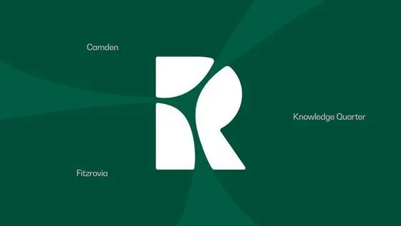
A white geometric R letterform with curved negative space on a deep teal ground, anchored by neighborhood location names.
Summary
A white geometric R letterform composed of curved segments around negative space, centered on deep teal, with surrounding location names (Camden, Fitzrovia, Knowledgae Quarter) positioning the mark spatially.
Visual description
A geometric R mark built from white curved strokes that form clean loops and angles, creating balanced voids inside the letterform. The R sits centered on a deep teal (approximately #004F39) background with a subtle angular gradient texture. Three location names in light sans-serif type appear positioned around the central mark: Camden top-left, Fitzrovia left-center, Knowledgae Quarter right-center. The overall composition uses the deep teal-to-lighter-teal gradient as a soft atmospheric layer, suggesting spatial depth while keeping the white mark as the clear focal point.
Key takeaway
The clever use of a single monochromatic letterform paired with location text as a spatial identity device, making the mark do double duty as both logo and location indicator. The negative space inside the letter carries equal visual weight to the strokes, creating dynamic asymmetry within a geometric constraint.
Reuse notes
Particularly strong for real-estate, hospitality, or location-based services where anchoring a mark to specific neighborhoods or districts adds narrational value. Works well at small scale because of the clear enclosed shapes. The cool teal palette reads calm and trustworthy, suiting fintech or institutional brands seeking gravitas without coldness.
More like this








Keep what you find
A free account saves references to boards and can send you a weekly email of picks based on what you save.
To see every result, go Pro.