Preview image. Unlock full-res
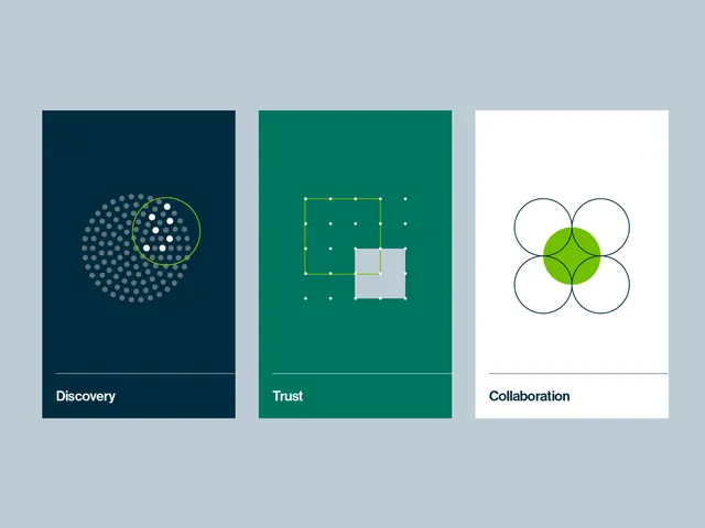
A three-panel icon system illustrating abstract concepts—Discovery, Trust, and Collaboration—using distinct geometric patterns and navy, teal, and white backgrounds.
Summary
Three vertical panels each illustrating a value or concept through a distinct geometric icon: a gray dotted spiral under "Discovery" on navy, a lime-green grid-and-square composition under "Trust" on teal, and four overlapping circles with a lime center under "Collaboration" on white.
Visual description
Three equal-width vertical rectangles displayed side by side on a light gray background. Left panel: navy-blue background with a spiraling dot pattern (grays and whites) enclosed in a yellow-green circle outline. Center panel: rich teal background with a geometric grid pattern (white dots and lines) and a light gray square at center, framed in bright lime-green strokes. Right panel: pure white background with four identical circles (dark blue outlines) arranged in a four-leaf pattern, overlapping to form a lime-green diamond in the center. Each panel has a thin white dividing line below its icon, with a white label bar containing the concept name in clean sans-serif type.
Key takeaway
Using distinct, recognizable geometric patterns to make each concept visually unique rather than relying on subtle color shifts alone. The color hierarchy: bold backgrounds for concepts on the left/center, white for the rightmost as a reset. Consistent use of one accent color (lime-green) across all three panels ties the system together. Simple labels make the icons immediately actionable.
Reuse notes
Ideal for B2B consulting, fintech, or software companies that need to distill values or capabilities into a visual language. The three-panel format works well as a hero section, case study opener, or values statement. Scales easily to square icon variations for web or app use. The white panel provides a natural pause and is suitable for product/SaaS branding seeking a professional, approachable tone.