Preview image. Unlock full-res
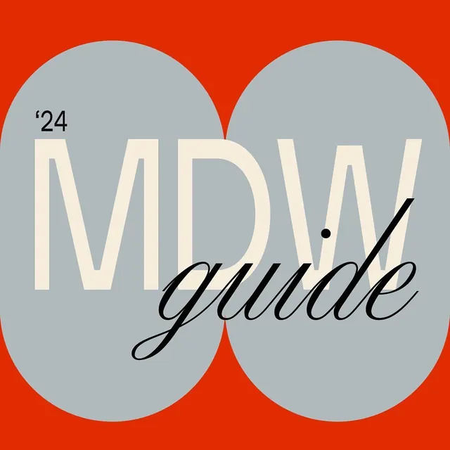
Type specimen mixing cream-colored display sans-serif with black italic script on overlapping gray circles against a bold red-orange background.
Summary
A minimalist type specimen combining oversized cream display type and italic black script across two overlapping circles framing the layout against a vibrant red-orange field.
Visual description
The composition centers on two large, overlapping gray circles that create negative space on a bold red-orange background. The main word "Mod guide" is split across the circles: "MOD" in a large, serif-like cream-colored display typeface with generous tracking, and "guide" in an elegant black italic script that flows diagonally. A small "'24" mark sits above in the upper left, adding a dateline quality. The color contrast between the red background, muted gray circles, cream type, and black accents creates high visual impact with restrained palette.
Key takeaway
The nested-circle framing device cleanly contains two distinct typographic voices without competing for attention. The mixing of a geometric display font with a flowing script font creates personality while the high-contrast color palette (warm background + cool grays + warm cream type) reads as premium and confident.
Reuse notes
Strong reference for type-driven branding, packaging guidelines, and publishing. The 2-circle composition scales well across formats. Works best when you have two contrasting typefaces worth showcasing and a bold background color to anchor the geometry.
More like this




Keep what you find
A free account saves references to boards and can send you a weekly email of picks based on what you save.
To see every result, go Pro.