Preview image. Unlock full-res
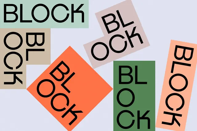
The word 'BLOCK' set in a bold, geometric sans-serif across five rotated rectangular and square forms in distinct pastel, neutral, and vibrant hues on a light lavender background.
Summary
A typographic specimen displaying the word "BLOCK" repeated across five rotated geometric forms (a diamond, a 45-degree tilted square, a vertical rectangle, and two smaller rectangles) in sage green, coral orange, cream beige, and pink tones against a light periwinkle background.
Visual description
Light lavender background. Five rectangular/square forms of varying size, each rotated 15 to 45 degrees and filled with distinct solid colors: sage green, coral-orange, pale pink, cream beige, and light grey. Bold, uppercase sans-serif letterforms ("BLOCK") in black set horizontally within each shape, left-aligned or centered. The forms overlap and float asymmetrically, with the largest diamond-shaped form anchoring the center-left. Thin white dividing lines frame the entire composition against the background.
Key takeaway
The technique of rotating and color-blocking geometric forms to create visual rhythm and movement from static, flat typography. The interplay of form size and color saturation (vivid orange against muted greens and beiges) creates focal hierarchy. Display faces with consistent stroke weight and generous spacing work well in this modular, rotated treatment.
Reuse notes
Strong reference for contemporary branding, educational materials, or experimental editorial layouts. The playful rotation and color-blocking strategy works for type-heavy campaigns or design systems needing visual drama. Pair with clean, minimal body copy to balance the kinetic display layer.
More like this


Keep what you find
A free account saves references to boards and can send you a weekly email of picks based on what you save.
To see every result, go Pro.