Preview image. Unlock full-res
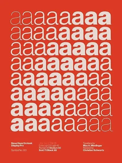
Neues Haas Grotesk typeface specimen using a bold red-orange background with repeated 'a' characters in grid formation to showcase weight and size variations.
Summary
Neues Haas Grotesk typeface specimen using a bold red-orange background with repeated 'a' characters in grid formation to showcase weight and size variations.
Visual description
A vibrant red-orange background fills the entire vertical composition. Eight rows of lowercase 'a' characters are arranged in a grid, each row showing subtle variations in weight and proportional styling. The typeface is geometric sans-serif, angular and precise, with consistent letter spacing within each row. Small type credit at the bottom left reads "Neues Haas Grotesk / Display Pro" with additional specification details (Syntax No 00), and on the right, a designer credit line. The warm color and dense pattern create high visual contrast and immediate rhythm; the repetitive structure allows the typeface's nuances to emerge through subtle tonal and weight shifts.
Key takeaway
Using a single repeated character as a specimen technique reveals weight and sizing nuances more effectively than showing full alphabets. The bold color background (rather than white) makes the typeface feel contemporary and confident rather than academic. The grid structure creates pattern-based visual interest while remaining legible and organized, proving the typeface's versatility across scales and weights.
Reuse notes
Strong for showcasing geometric, precise typefaces where weight variation and size scaling are key features. The high-contrast bold-background approach works especially well for display or headline typefaces. Use this format when you want to emphasize a typeface's construction and optical precision rather than showing it in use. The minimalist approach also works as a poster or educational print piece for design schools and type foundries.
More like this




Keep what you find
A free account saves references to boards and can send you a weekly email of picks based on what you save.
To see every result, go Pro.