Preview image. Unlock full-res
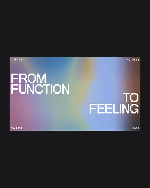
A typography-driven layout overlaid on a soft rainbow gradient, demonstrating how type placement and color transitions can express a conceptual message about transformation.
Summary
A type-centric composition pairing a soft rainbow gradient mesh with large white display type positioned across the color field, expressing directional narrative through spatial arrangement.
Visual description
Centered on a dark background is a soft gradient rectangle roughly 4:3 aspect ratio, blending lavender, sky blue, pale yellow, and dusty mauve in smooth color transitions. Large white sans-serif text reads "FROM FUNCTION" on the left side and "TO FEELING" on the right, with both phrases in all-caps, positioned to frame the gradient's center. Smaller context labels appear at the four corners: "AIRPORT" and "FUTURES" at the top, "GHARAGE" and "2024" at the bottom. The type rests directly on the gradient with no container, allowing the color field to breathe beneath the letterforms.
Key takeaway
The core idea: use type placement and directional reading to guide interpretation of a soft, undifferentiated gradient background. The gradient itself has no obvious subject, but the words transform it into a conceptual visualization of a specific journey. Corner labels provide context without competing for attention. Soft color harmonies and white type keep the focus on language rather than ornament.
Reuse notes
Effective for brand statements, campaign taglines, or concept identity systems that prioritize message over image. Works well as a cover slide, poster, or large format application. The soft gradient is forgiving on low-contrast displays. Avoid for small-scale reproduction or screen sizes under 400px wide where text may overlap.
More like this
Keep what you find
A free account saves references to boards and can send you a weekly email of picks based on what you save.
To see every result, go Pro.