Preview image. Unlock full-res
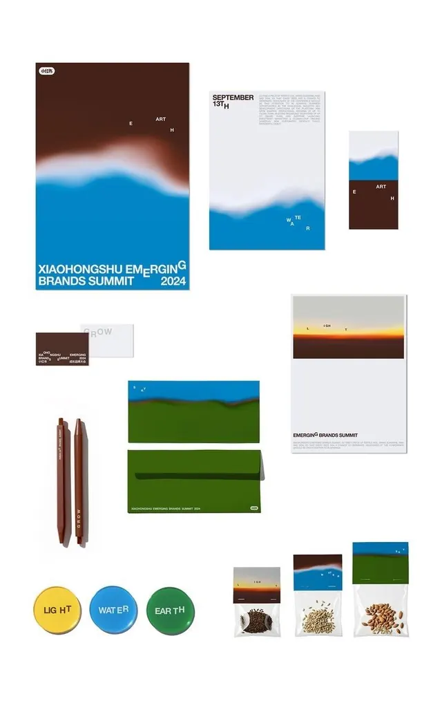
A summit identity system using soft landscape gradients of sky, water and earth across posters, stationery, badges and seed-packet giveaways under a GROW theme.
Summary
A full event identity for an emerging-brands summit built on blurred landscape gradients, brown earth, blue water, olive ground, sunset light, applied as a "GROW" theme across posters, stationery, pen sets, button badges and literal seed-packet giveaways.
Visual description
The image is a flat-lay mockup grid on white. The hero poster blends a brown-to-blue horizon gradient with the summit title set in a condensed sans, where stray letters jump baseline (the G and H float up). Supporting pieces repeat the system: a letterhead and notepad fading into a soft mountain gradient, a sunset-horizon poster labeled LIGHT, business cards reading GROW, green and blue envelopes, a pair of brown pens, and three button badges in yellow, blue and green reading LIGHT, WATER, EARTH. The set closes with clear seed packets, each topped by a matching gradient band and filled with actual coffee beans, grains and almonds.
Key takeaway
Turn an abstract theme word (GROW, with LIGHT / WATER / EARTH) into a literal material giveaway, here seed and grain packets, so the brand idea becomes a physical object. The soft atmospheric horizon gradient is reused as a connective device across every touchpoint, while the jumping baseline letters add motion to otherwise plain condensed type.
Reuse notes
A strong reference for conference, festival, or launch identities that need many coordinated collateral pieces on a single visual idea. The landscape-gradient approach feels organic and premium without photography. Best when you can commit to a tangible takeaway item; the gradient system also needs careful production to avoid banding in print.
More like this







Keep what you find
A free account saves references to boards and can send you a weekly email of picks based on what you save.
To see every result, go Pro.