Preview image. Unlock full-res
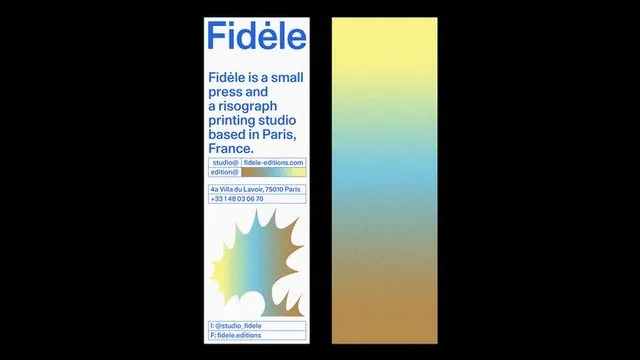
A vertical brand card for Fidele, a Paris risograph press, pairing a tall blue-type info column with a grainy yellow-to-blue-to-tan gradient panel and a burst graphic.
Summary
Two vertical panels on black: a white info card for Fidele, a small Paris risograph press, set entirely in blue type, sitting beside a tall grainy gradient swatch running yellow to blue to tan.
Visual description
The left card is white with all text in a single blue. A large display-weight "Fidele" headline tops a short blue paragraph describing the studio, followed by thin blue-outlined boxes holding email, address and phone fields, then a centered black-and-white starburst or splat graphic, and a final outlined contact-handle box at the bottom. The right panel is the same height: a continuous riso-style grainy gradient blending pale yellow at top into sky blue and down to warm tan, mimicking the analog ink texture of a risograph print. Everything floats on a flat black background that frames both panels.
Key takeaway
Translate the press's actual output (the grainy riso gradient) into a brand swatch and pair it with a monochrome blue type card, so the identity demonstrates the product instead of just describing it. Thin outlined boxes turn contact details into a structured field system.
Reuse notes
Great for a printer, press, or studio whose process has a signature texture worth showcasing. The single-ink blue type and grain feel intentionally analog; pairs well with riso or letterpress collateral. Needs the grain to be real, not a flat gradient.
More like this



Keep what you find
A free account saves references to boards and can send you a weekly email of picks based on what you save.
To see every result, go Pro.