Preview image. Unlock full-res
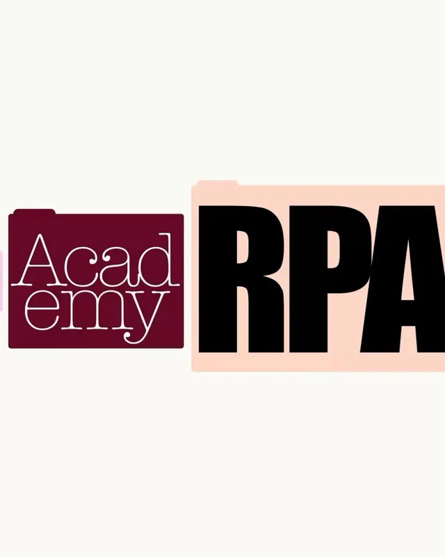
A type specimen pairing a delicate serif outline font (Academy) on burgundy with a bold display serif (RPA) on pale pink, separated by strong color blocking and rounded corners.
Summary
A type specimen pairing a delicate serif outline font (Academy) on burgundy with a bold display serif (RPA) on pale pink, separated by strong color blocking and rounded corners.
Visual description
Two-part composition with sharp vertical divide. Left: a burgundy rounded rectangle (burgundy-wine, approximately Pantone 207C) containing "Academy" set in a light outline serif font, the letter forms appearing hollow with crisp thin strokes. Right: a pale peachy-pink rounded rectangle containing "RPA" in a bold, high-contrast black display serif with substantial weight and generous spacing. The white background provides clear separation and breathing room. Both rounded corners soften the geometric severity of the blocking.
Key takeaway
The use of outline vs. solid weight contrast to differentiate two related type families. The color pairing of burgundy and soft pink creates warmth despite the formal serif treatment. The rounded corners on color blocks prevent corporate cold-ness while maintaining professional clarity.
Reuse notes
Ideal for education tech, professional services, or luxury brands needing dual typography systems. The outline serif works well for headlines or delicate contexts; the bold serif anchors body or emphasis. The high contrast between forms and colors ensures legibility in both print and digital applications. Avoid for playful or informal brands.
More like this





Keep what you find
A free account saves references to boards and can send you a weekly email of picks based on what you save.
To see every result, go Pro.