Preview image. Unlock full-res
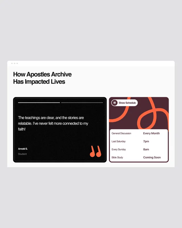
Minimal identity system for How Apostles Archive combining austere black cards with warm orange accents and clean typography.
Summary
Minimal identity for an archive of missionary stories pairing stark black information cards with warm orange geometric branding on a light gray background.
Visual description
Two card systems on a light gray field. Left: a dark charcoal card with small all-caps sans-serif label and two lines of light gray body text describing archived teachings. Right: a light card with orange geometric accent shapes at top, structured form elements with labels (keywords, dates, categories listed in minimal sans-serif), and filled circular navigation buttons. The orange is warm and restrained, appearing in geometric corner details and circular UI elements only. Typography is sparse, sans-serif in light weights, emphasizing information density over visual noise.
Key takeaway
The extreme restraint of the color palette (three neutrals plus one warm accent) and how orange serves as both brand mark and functional UI element; the use of card separation and negative space to organize complex archival data; the confident use of all-caps labels in tiny weights for category and metadata.
Reuse notes
Ideal for mission-driven, nonprofit, or cultural organizations where authority and information clarity are paramount. Works well paired with serious subject matter (archives, history, research). The warm accent prevents coldness but remains professional. The card separation pattern scales well to digital product interfaces.
More like this






Keep what you find
A free account saves references to boards and can send you a weekly email of picks based on what you save.
To see every result, go Pro.