Preview image. Unlock full-res
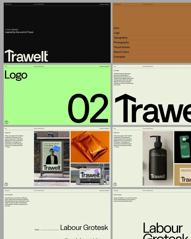
A comprehensive visual identity system for Trawelt, a travel brand, spanning logo, typography, color palette, and applied mockups across signage and product.
Summary
A comprehensive visual identity system for Trawelt, a travel brand, featuring a bold sans-serif wordmark, nature-inspired earth-tone and lime-green palette, and consistent application across signage, packaging, and product mockups.
Visual description
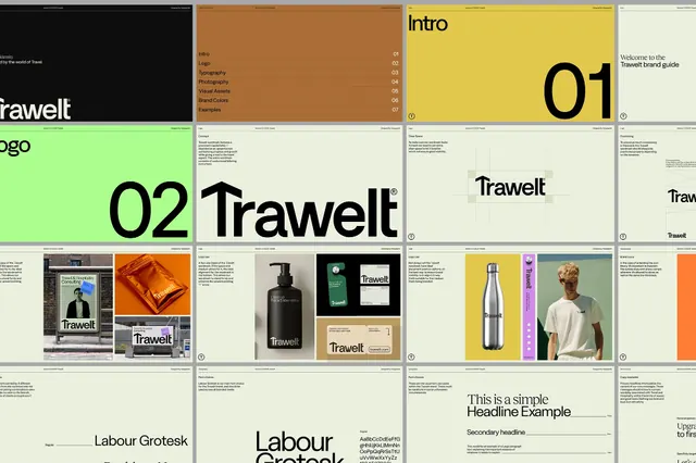
A structured, multi-panel guide showing the Trawelt brand system. The logo is a clean, modern sans-serif wordmark set in a heavy, geometric typeface (Labour Grotesk or similar). A lime-green accent color dominates the palette, paired with dark forest greens, warm oranges/terracottas, and neutral creams and grays. Typography panels show the family's scale and weight hierarchy. Applied mockups display the logo on street signage, product packaging in warm tones, and branded collateral in dark green and cream. The overall treatment is restrained and sophisticated, with generous white space and hierarchical clarity typical of luxury travel and consulting identities.
Key takeaway
The color combination: vibrant lime-green as a modern energetic accent against a muted, earthy core palette (dark green and warm terracotta). The extreme typographic restraint, relying on a single, confident sans-serif in various weights. The modularity of the system, allowing the logo to breathe on applied materials without redundant color or complexity.
Reuse notes
Ideal for upscale travel, tourism, consulting, or adventure-brand identities aiming for sophistication without coldness. The lime accent brings contemporary energy to a traditionally conservative palette. The system scales well from web to print to physical signage. Best when product photography or photography style guide reinforces the warm, grounded aesthetic shown in the mockups.
More like this





Keep what you find
A free account saves references to boards and can send you a weekly email of picks based on what you save.
To see every result, go Pro.