Preview image. Unlock full-res
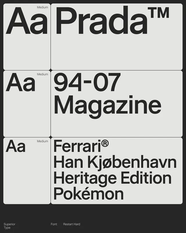
Typography specimen showcasing Prada sans-serif at medium weight across three branded applications with precise grid alignment.
Summary
Three modular typographic stacks demonstrating Prada sans-serif letterforms at medium weight across different contexts: wordmark, numeric title, and brand+variant combinations on a light background.
Visual description
A vertical grid composition in neutral grays and white. Each row displays a reference mark (Aa at left, labeled "Medium") paired with a typographic application: the Prada wordmark with superscript trademark; the title "94-07 Magazine"; a three-line stack for Ferrari Han Kjobenhavn Heritage Edition Pokemon. Sans-serif letters are sharp, geometric, evenly spaced, and rendered in a single dark weight against the light field. White borders separate each cell, reinforcing the modular structure.
Key takeaway
The labeled reference system (showing scale and style before context) gives clarity to a type specimen. The strict modular grid and consistent cell height make different typographic scales feel cohesive even when stacked. Using neutral backgrounds and single weight keeps focus on letterforms.
Reuse notes
Effective for presenting corporate typefaces, luxury brands, or multi-language typeface systems. The layout works best when each application is distinct (logo, headline, body text pairing) so the scale and context shift is visible. Clean approach for design systems or type-licensing presentations.
More like this







Keep what you find
A free account saves references to boards and can send you a weekly email of picks based on what you save.
To see every result, go Pro.