Preview image. Unlock full-res
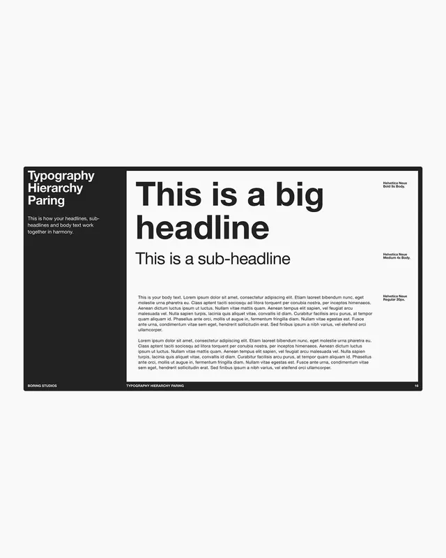
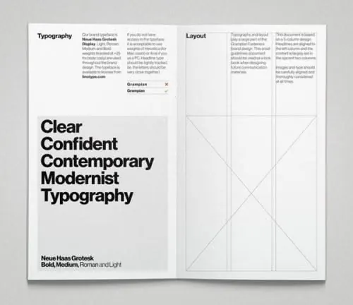
Design system page documenting type scale relationships using three text sizes paired with margin annotations in a split-column layout.
Summary
Design system guide page showing headline, subheading, and body copy in a three-tier type scale with right-margin font annotations and left-side explanatory bar.
Visual description
A dense, grid-ordered guide page split into left and right columns. The black left column (roughly one-third width) carries white typography explaining the principle (title, short copy, studio credit, and page identifier). The right side (two-thirds) displays the actual type samples: a massive headline in bold sans, a smaller subheading, and two columns of body text below. Margin notes in gray identify each typeface by name and weight. The page is numbered 16 at bottom right. The composition is strictly linear, leveraging white space and justified margins to enforce hierarchy.
Key takeaway
The margin-annotation strategy: instead of captions under or across samples, type names sit in the outer margin, keeping the text itself uncluttered and the grid tight. The three-tier scale (headline, subhead, body) is clear enough to serve as a reference without additional diagrams. The black sidebar containing the principle itself is a clever dual-use element: it anchors the layout and provides context without taking focus from the samples.
Reuse notes
Essential template for brand guidelines, design system docs, and editorial publications that need to show type hierarchy systematically. Works well when your audience needs to understand the exact weights, sizes, and relationships at a glance. The stark black-and-white palette keeps visual noise low.
More like this


Keep what you find
A free account saves references to boards and can send you a weekly email of picks based on what you save.
To see every result, go Pro.