Preview image. Unlock full-res
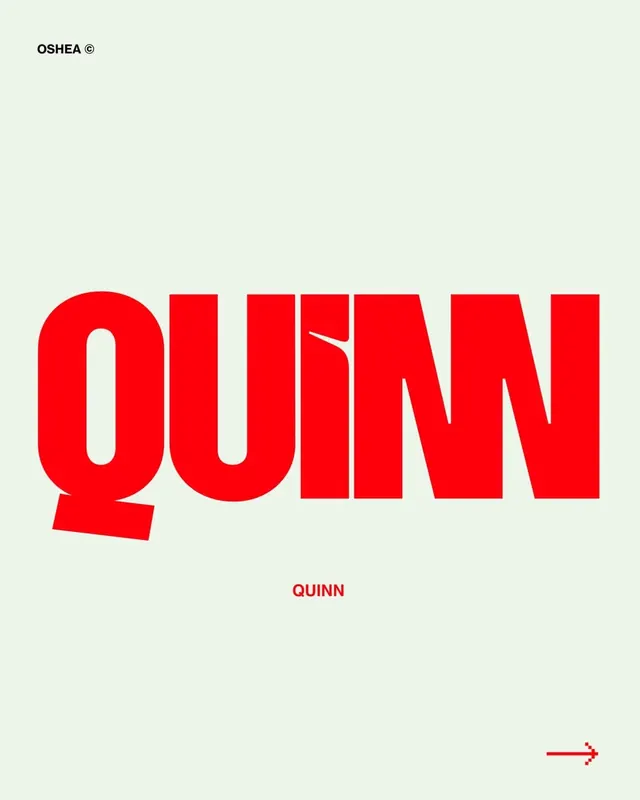
A bold, high-impact wordmark for Quinn using a condensed sans-serif font in vibrant red against a soft cream background.
Summary
A condensed sans-serif wordmark for Quinn set in vibrant red with generous negative space on a soft cream background.
Visual description
The wordmark "QUINN" fills the center of the composition in a bold, heavy-weight sans-serif typeface with condensed letter spacing and high stroke weight. The letters are bright, saturated red against a warm cream background. The design is asymmetric: the top-left corner shows "OSHEA" in small capitals at the same red weight, establishing a visual hierarchy. Below the main wordmark appears "QUINN" again in red at a smaller scale. A small red arrow pointing right sits in the lower-right corner. The overall treatment is minimal and confident, with the typeface carrying all visual weight.
Key takeaway
The confidence of using a single bold typeface with maximum scale and breathing room. The subtle secondary marks (top label, bottom mark reference, and directional arrow) that anchor the primary wordmark without cluttering it. The warm cream background providing contrast without harshness.
Reuse notes
Strong for consumer brands, hospitality, or agencies seeking bold, immediate recognition. The red reads hot and energetic; pair with imagery that is equally confident or let it stand alone. Works best at large scale where the letterforms' character is felt.