Preview image. Unlock full-res
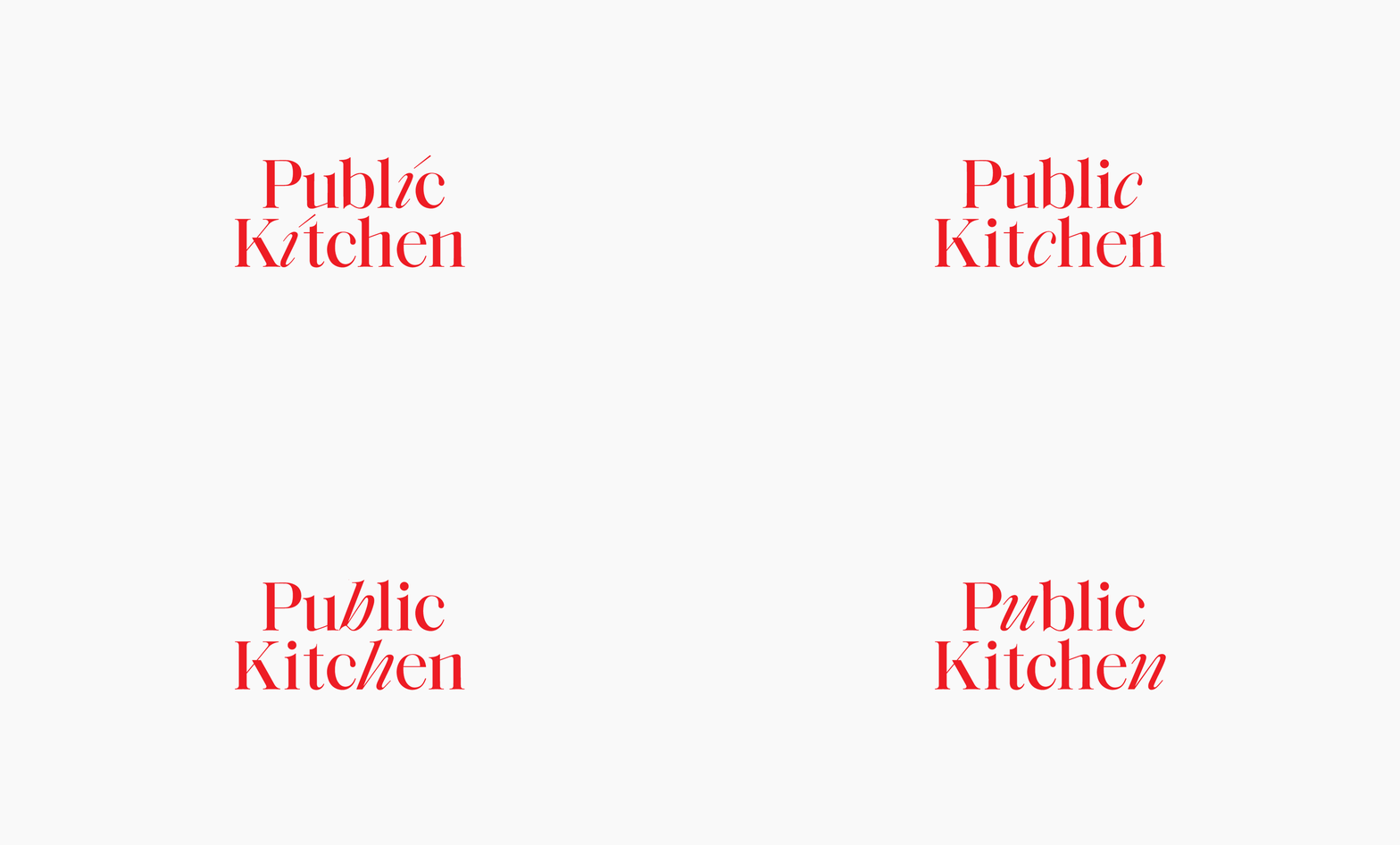
A two-line Public Kitchen wordmark in bright red high-contrast serif on off-white, distinguished by quirky angled-dot i's and flared, slightly irregular letter terminals.
Summary
A "Public Kitchen" logotype set two lines deep in a bright red high-contrast serif on a near-white ground. The character comes from its details: dramatically thick-to-thin strokes, flared open terminals, and the dots over the i's tilted into little slashes.
Visual description
The mark is centered in a wide off-white frame with generous surrounding space, the type carrying all the weight. "Public" stacks above "Kitchen," both in a Didone-leaning serif with strong stroke contrast and elegant flared serifs. Several letters break from convention: the i tittles are set as small angled dashes rather than round dots, some terminals flare or curl, and a couple of strokes sit slightly off the baseline, giving the otherwise refined serif a playful, hand-tuned wobble. The single bright red against the pale ground is the only color event; there is no tagline, icon, or supporting mark.
Key takeaway
Take a high-contrast Didone and customize a few small details (slash the i-dots, flare a terminal, nudge a stroke off-baseline) to turn a stock-feeling serif into a distinctive logotype. One saturated color on near-white is enough to make a pure-type mark feel designed.
Reuse notes
A natural fit for restaurant, cafe, or hospitality branding that wants to read both upscale and approachable. The thin hairlines will break up at small sizes or in embroidery, so keep a heavier alternate for favicons and signage. The lone red works best with a restrained, mostly neutral surrounding system.
More like this

Keep what you find
A free account saves references to boards and can send you a weekly email of picks based on what you save.
To see every result, go Pro.