Preview image. Unlock full-res
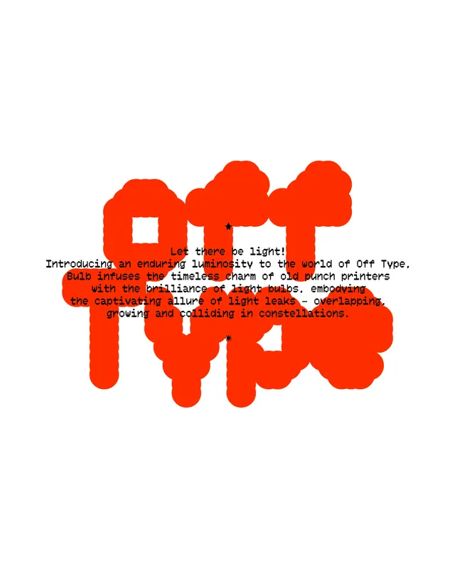
A bold red-orange monogram spelling 'LIGHT' in rounded, blob-like letterforms with white cutouts, designed to echo the mechanics of vintage punch-card printers.
Summary
A monogram identity for Off Type, a typeface foundry. The word "LIGHT" rendered as interlocking blob-shaped letterforms in vivid red-orange with white cutouts, evoking the patterned glow of illuminated punch-card readers.
Visual description
A single white background hosts a centered, large-scale monogram composed of the letters L-I-G-H-T merged into a unified form. The letterforms are built from smooth, rounded shapes with generous curves and bulbous joints. White negative space cuts through the solid red-orange body of each letter, creating holes and voids that reference the punch-card aesthetic. The overall effect is organic and sculptural despite the geometric foundation. Supporting text appears overlaid in a monospace typeface, describing Off Type as introducing "an enduring luminosity to the world of Off Type" and invoking "the timeless charm of old punch printers with the brilliance of light bulbs."
Key takeaway
The use of white cutouts as both a functional design move and a conceptual link to the brand's historical inspiration. The blob letterforms create unity across disparate glyphs while maintaining legibility. The restricted two-color palette (white + red-orange) delivers maximum impact without complexity.
Reuse notes
Effective for foundries, maker brands, or any identity embracing retro-tech nostalgia. The high-contrast punchy color works best at large scale and for bold applications. Works well on digital and print; the negative space can be adapted for embossing or die-cut applications.
More like this

Keep what you find
A free account saves references to boards and can send you a weekly email of picks based on what you save.
To see every result, go Pro.