Preview image. Unlock full-res
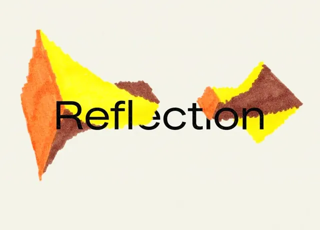
A brand concept pairing geometric-organic shapes in warm yellows, oranges, and browns with a bold sans-serif wordmark against cream.
Summary
A brand exploration using warm color-blocked organic shapes flanking a bold sans-serif wordmark on a neutral background, balancing geometric precision with flowing forms.
Visual description
The design centers a black sans-serif word "Reflection" flanked by two asymmetric groups of angular, faceted shapes. Left cluster: sharp orange triangular forms layered with a burgundy wedge. Right cluster: angular yellow and dark-brown shapes mirroring the left in opposing orientation. All shapes have clean edges yet convey an organic, hand-sketched quality. Cream background frames the composition, placing color in high relief. The balance feels intentionally dynamic rather than symmetrical, pulling the eye across the word.
Key takeaway
The tension between strict geometric forms and the organic way they nestle together. The warmth of the five-color palette keeps geometric abstraction from feeling cold. The wordmark acts as an anchor without dominating, proving you can build personality around secondary letterforms.
Reuse notes
Strong for identity exploration at the concept stage or for brands wanting warmth without resorting to curves. The color blocking is distinctive enough that the system could extend to secondary shapes, icons, or product photography crops. Works best on light or neutral backgrounds; less effective on colored stock.
More like this



Keep what you find
A free account saves references to boards and can send you a weekly email of picks based on what you save.
To see every result, go Pro.