Preview image. Unlock full-res
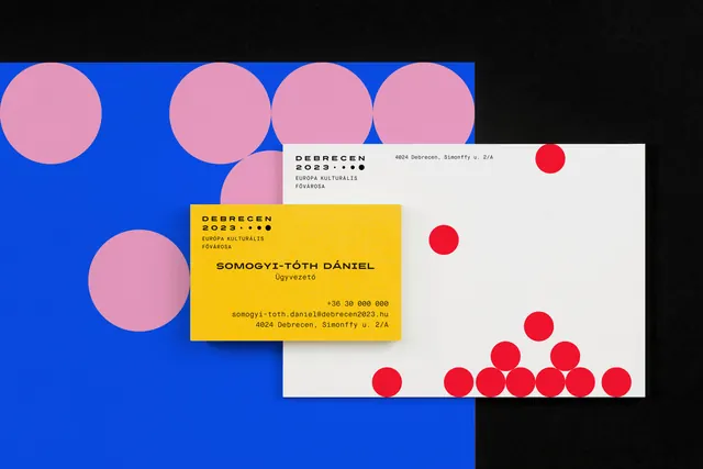
A yellow business card overlapping a white letterhead scattered with red dots, staged on a blue sheet of oversized pink circles against black.
More like this
See all

Summary
A stationery flat-lay that carries the circle motif across three layers at three scales: huge pink discs on the backdrop, medium red dots on the letterhead, and the tiny dot row inside the logo block itself.
Visual description
Shot from directly above on a black surface. A blue sheet fills the left two thirds, bleeding off the left and bottom edges, printed with large flat pink circles that crop against its top and left borders. Angled slightly across it lies a landscape white correspondence sheet, its top-left corner carrying the identity block: DEBRECEN 2023 in letterspaced caps with a row of four dots ending in one filled dot, then "EURÓPA KULTURÁLIS FŐVÁROSA" on two lines. A street address sits at the top center in a small monospaced style. Red circles fall across the sheet in graduated sizes, a few loose ones in the upper area and a dense pyramid stacking up from the bottom right corner like settled particles. Overlapping the lower left of that sheet is a landscape yellow business card, repeating the same identity block top left, then a name in bold letterspaced caps with a title beneath it centered, and a right-aligned block of phone, email and address in monospace at the lower right. Everything is black type on flat color; no images or icons.
Key takeaway
One motif at three different scales does all the work: the same circle is a background graphic, a decorative fall of dots, and a punctuation device inside the logo. The dots piling up in a corner rather than sitting on a grid gives a rigid Swiss layout a physical, gravitational feel.
Reuse notes
Useful when a strict typographic identity needs warmth in its stationery without photography or illustration. The staging depends on flat color prop sheets in the same palette, which is cheap to reproduce but reads as art direction rather than product. Watch the yellow card: black type on saturated yellow is legible, but the same treatment on the blue would not be.