Preview image. Unlock full-res
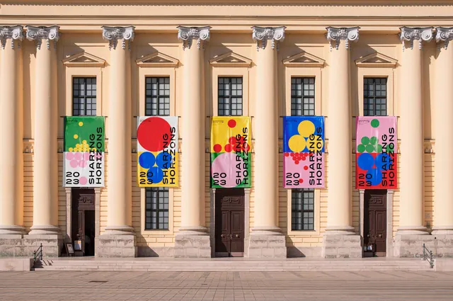
Three Sharing Horizons event posters flyposted on a weathered wall in raking sunlight, including a ballet bill with black and white dancers and a stacked red dot pyramid.
More like this
See all

Summary
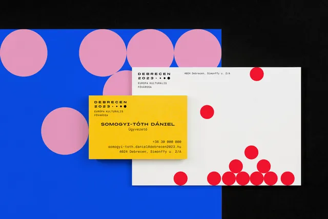
The poster system photographed where it actually lives: three sheets pasted on a rough wall under hard side light, one of them a ballet bill that runs a red dot pyramid up over a black and white photograph.
Visual description
A dim covered walkway shot from the side. A white concrete column crosses the left third of the frame and its shadow falls across the wall; an orange metal door with graffiti sits at the far right. Three posters are pasted onto weathered blue-grey timber and plaster. The leftmost, partly hidden by the column, is split blue over pink with large yellow discs above and a pyramid of red dots below, "20 23" in black numerals at its lower left. The middle poster is green above and black below: heavy black all-caps event copy reading "...LM ...SZTIVÁL ...BRECEN" runs off the column edge, with pink circles stacking up from the seam, a bold "Vasárnap" subhead, two short paragraphs of lorem ipsum placeholder text and the date 2023/06/12; the black lower half carries a photograph of a cinema auditorium with a yellow disc bleeding in from the left. The right poster puts a black and white photograph of four dancers on top, a column of red dots climbing from a wide base at the lower left up over the image, then a yellow lower panel with "CSOKONAI SZÍNHÁZ BALETT" in heavy black caps interlocking with three large blue circles, a small bold subhead, a paragraph of placeholder copy and the date at the lower right. The identity block appears small and black in each poster's corner. Sunlight rakes in from the right, leaving the left half in deep shade.
Key takeaway
The dot cluster stops being decoration here and becomes a bridge: it climbs out of the color panel and across the photograph, tying the two halves into one poster. Letting the type interlock with the circles rather than clear them keeps a rigid grid from feeling like a template.
Reuse notes
Reach for this when presenting a cultural or event identity in situ, where grime, shadow and a partly obscured sheet make the work look real rather than rendered. The heavy contrast means the palette needs to survive being half in shadow, which these saturated primaries do. Body copy on all three sheets is lorem ipsum placeholder.