Preview image. Unlock full-res
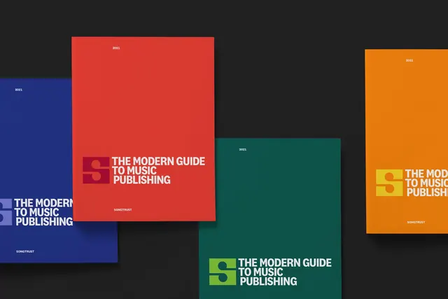
Four copies of the same publishing guide cover mounted on a black wall in blue, red, teal and orange, each pairing the monogram block with the title in a single flush lockup.
More like this
See all
Summary
One cover design shown in four colorways, staggered across a black wall to prove the layout holds no matter which color it is printed in.
Visual description
Four large portrait covers hang at different heights on a matte black wall, each casting a soft shadow, with the two outer covers cropped by the frame edges. The colorways run cobalt blue, scarlet, deep teal and orange. Every cover uses the same three elements: the year set small in white caps and centered at the top, a title lockup positioned in the lower third, and the brand name in small white caps centered below it. The lockup pairs a square block holding the S monogram with the title set flush left beside it across three lines in white condensed caps, the block and the monogram both drawn in a second tone of the cover color, so the mark reads as a tonal shift rather than a contrasting shape. Stock is matte and uncoated with no imagery or texture.
Key takeaway
Rendering the logo block in a lighter tint of the cover color rather than a contrasting one keeps the mark present without letting it fight the title. Four saturated colorways of one fixed layout make a series feel like a system rather than a reprint.
Reuse notes
Use when a report, guide or annual needs multiple editions to look related on a shelf, or when one publication is issued per audience segment. The layout is almost entirely typographic, so it depends on a distinctive monogram and a good condensed face. Centered year and footer against a flush-left title is a deliberate tension worth keeping consistent.