Preview image. Unlock full-res
The lowercase Tutu wordmark on deep navy, with the first syllable upright in near-white and the second slanted in periwinkle.
More like this
See all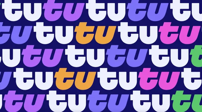


Summary
The wordmark presented alone at large scale, built from one heavy rounded lowercase alphabet split into an upright half and an italic half in two different tints.
Visual description
A flat deep navy field with the four letters centred and filling roughly half the frame width. The letterforms are very heavy with wide round bowls, flat horizontal terminals and small square notches where the t crossbars meet the stems. The first "tu" is upright and set in a near white with a faint blue cast. The second "tu" is slanted to the right in a mid periwinkle and sits slightly tighter, its t crossbar cutting across the preceding u. Both u letters carry a short vertical spur descending inside the bowl, drawn in the navy background colour so it reads as a cut rather than a stroke. Letter spacing is tight enough that adjacent letters almost touch, and there is no additional mark, tagline or container.
Key takeaway
Splitting a repeated syllable into upright and italic states turns a plain duplicate word into a piece of motion, suggesting departure and arrival without any icon. Punching the u spurs out in the background colour keeps the mark readable when the two tints are close in value.
Reuse notes
The core asset for the whole system; every other frame in this project reuses this two tone split. Works because the name repeats, so it will not transfer to a name without a doubled syllable. The two tints need enough separation to survive small sizes, and on a light ground the relationship would have to be re-tuned.