Preview image. Unlock full-res
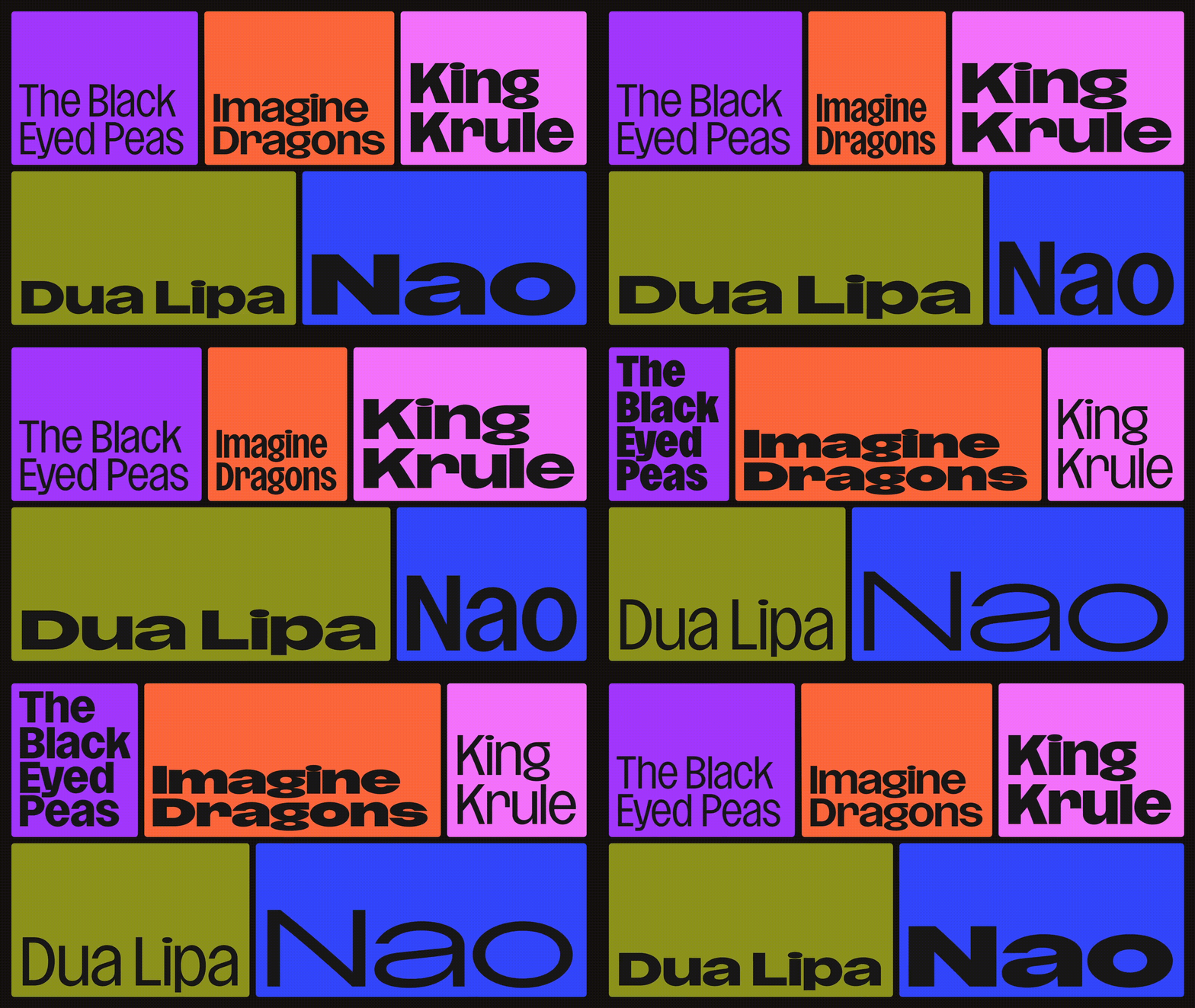
Colour-blocked grid of artist names where the typeface shifts weight and width so each name refills its block as the blocks resize.
More like this
See all

Summary
A five-block colour grid used as a type specimen: each block holds one artist name, and the type animates through weight and width so the name always fills its box while the boxes themselves resize.
Visual description
Two rows sit on black with thin black gaps acting as rules. The upper row holds three blocks, violet with "The Black Eyed Peas" on three or four lines, orange with "Imagine Dragons" on two, and pink with "King Krule" on two. The lower row holds two, an olive block with "Dua Lipa" and a blue block with "Nao", both on a single line. All type is black, mixed case, in a geometric grotesque with a circular o and a single-storey feel at heavier weights. Through the loop the blocks change proportion, the violet one narrowing while the orange one widens and vice versa, and the type inside changes with them: names move between light and very bold, and between condensed and wide, re-wrapping onto more or fewer lines so the text always meets the block edges. Nothing else appears in the frame, no marks, no imagery.
Key takeaway
Letting the type stretch to the container rather than sizing the container to the type turns a plain grid into an editorial system, and the weight and width shifts carry rhythm the way a soundtrack would. Black gaps instead of white keep five loud colours from vibrating against each other.
Reuse notes
A strong pattern for artist, speaker or contributor line-ups, festival bills and title cards, and for any place a variable font is already in the stack. It needs names of varied length to be interesting, and every colour must take black type, so pale or fluorescent tones will need checking for contrast.
More like this


Keep what you find
A free account saves references to boards and can send you a weekly email of picks based on what you save.
To see every result, go Pro.