Preview image. Unlock full-res
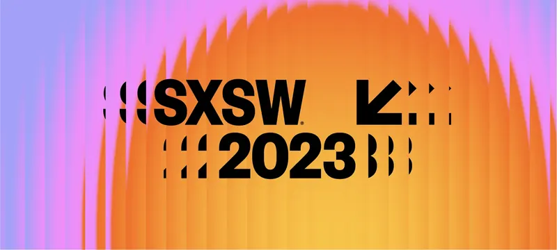
Festival logotype in heavy black sans sitting on a striped orange-to-violet gradient, with sliced letterform fragments flanking each line.
More like this
See all
Summary
A wide banner locking the SXSW 2023 logotype and its arrow mark over a striped gradient sunrise, with cut-up letterform fragments extending each line.
Visual description
The image is a broad landscape crop. Its background is a gradient reading violet blue at the far left through pink and magenta into a large orange and yellow dome that rises from the bottom center, suggesting a sun. The whole field is broken by narrow vertical bands of slightly shifted tone, like a curtain or a scanline pass, strongest at the edges. Centered over it, in solid black, "SXSW" runs across the upper line with a small registered trademark symbol at its baseline, and "2023" sits on the line below, both in a very heavy grotesque with tight spacing. To the left of each line, and to the right of "2023", sit clusters of sliced letterform pieces: half circles, bracket shapes, and vertical bars that read as fragments of the same typeface cut on a grid. To the right of "SXSW" a bold arrow points down and left, followed by a small triangle and two more sliced marks. Everything is black on the gradient, with no other color in the type layer.
Key takeaway
Cutting the typeface into geometric fragments and setting them as flanking ornament turns a fixed logotype into a variable pattern without redrawing the mark. The vertical banding over the gradient adds texture and a sense of motion to what would otherwise be a flat blend.
Reuse notes
A useful model for annual festival or event identities that must keep a legally fixed wordmark but need fresh art each year: change the gradient, keep the fragment system. The fragments read as noise at small sizes, so a simplified lockup would be needed for favicons or badges. The black-on-gradient contrast is strong in the orange zone but weakens over the violet, so check placement per crop.
More like this



Keep what you find
A free account saves references to boards and can send you a weekly email of picks based on what you save.
To see every result, go Pro.