Preview image. Unlock full-res
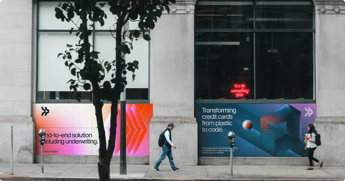
Street-level photograph of two gradient brand panels wrapped along the base of a grey stone building, with passers-by walking past.
More like this
See all
Summary
The Deserve gradient system applied as full-height hoarding panels on a downtown building, photographed straight on at street level so the graphics sit against real concrete, meters and pedestrians.
Visual description
A grey stone facade with tall dark-framed windows fills the top two thirds of the frame. Below the sills, two brand panels run along the wall. The left panel fades from pale warm grey into magenta and hot orange, carries the bracket-shaped mark at top left, a row of repeated chevron arrows on the right half, and the line "End-to-end solution including underwriting" in dark grey with "Full Stack Platform." underneath. The right panel is dark navy to violet with an isometric cube form, a small orange and blue sphere, the headline "Transforming credit cards from plastic to code." in white on the left, three lines of small sub-copy beneath it, and the mark repeated at top right. A bare street tree, two parking meters and a light pole cross the panels; two pedestrians walk past at opposite ends. Inside the right-hand window a small red neon sign reads "TELL ME something GOOD". Overcast daylight keeps the concrete flat so the gradients carry all the colour.
Key takeaway
Splitting one campaign into a light panel and a dark panel on the same wall gives the identity range without breaking the gradient language. Real obstructions in front of the artwork sell the scale far better than a clean flat render would.
Reuse notes
Reach for this when presenting brand graphics at architectural scale, or when a fintech identity needs a physical-world proof point. The tree and pole partly cover the left headline, so any copy placed this way has to survive being clipped; plan the layout so the panel still reads with a third of it obscured.