Preview image. Unlock full-res
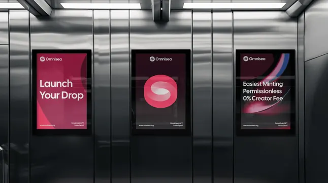
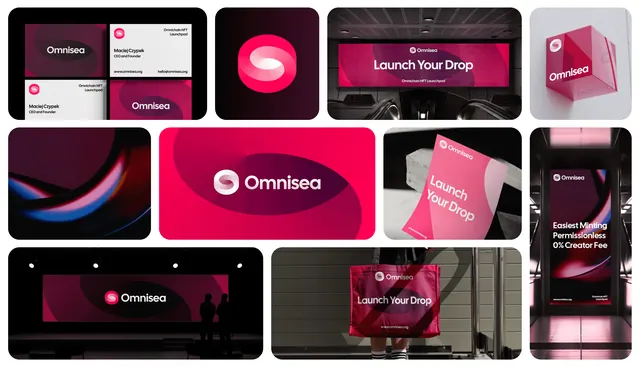
Three portrait digital posters in a brushed-steel elevator, running a headline panel, a mark-only panel and a benefits panel in the same magenta system.
More like this
See all
Summary
Three vertical screens mounted side by side on a brushed-steel wall, showing three variations of the same poster template: message, mark, and benefit list.
Visual description
The setting is a metal-panelled lift or corridor with a strip light overhead and long vertical reflections running down every surface. Three portrait screens hang at equal height and spacing. Each carries the same skeleton: the horizontal lockup of swirl mark and wordmark small at the top left, and a two-part footer with the url on the left and a two-line descriptor on the right. The left screen is a magenta field with a darker curved sweep and a two-line white headline in the upper middle. The center screen is near-black with a very large magenta rounded-square mark floating in the middle and nothing else. The right screen is a dark plum field crossed by a thin blue and pink light streak, with three lines of short white benefit copy stacked at mid-height. Horizontal banding from the photography runs across all three, and the steel wall picks up a faint magenta cast from the screens.
Key takeaway
A fixed header and footer plus one free middle zone is enough to make three different messages read as one campaign. Putting the mark-only panel in the center gives the run a breathing space and lets the identity, not a message, hold the middle position.
Reuse notes
Useful whenever a campaign has to fill several adjacent screens or frames in one sightline: lift lobbies, airport corridors, retail windows. Keep one panel deliberately empty of copy or the row becomes noise. The template depends on a persistent footer lockup, so budget vertical space for it before designing the middle.