Preview image. Unlock full-res
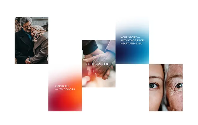
Editorial spread layout combining warm-toned portrait photography with solid color blocks in rust, coral, and cream, arranged in an asymmetrical grid.
Summary
Asymmetrical editorial layout interlocking photographs of people and hands with solid color fields in rust, coral, and cream, each block labeled with minimal serif titles.
Visual description
Five photograph and color-block elements nest in an irregular grid. Top left shows a close-up portrait of two faces in olive and natural tones. Below that, a rust-orange square with white serif typography. Top center contains a cream-colored rectangle with small serif text and a soft teal square above it. Top right shows a profile view of a single face with detailed skin texture. A coral block with rust underlay sits at lower left, its title set in warm rust serif type. Each photograph is cropped tightly; each color field is dense and matte, with text kerned generously. The arrangement feels like overlapping cards on a light neutral ground.
Key takeaway
Nested photographs and color blocks create rhythm without gridlines. Using warm skin-tone photography against pure saturated colors (rust, coral) makes neither dominate. Small serif type on large color fields acts as breathing room. The cropped, almost fragmentary composition feels more curated and editorial than evenly spaced.
Reuse notes
Strong for lifestyle, beauty, or product brands with strong portrait assets. The warm color palette reads approachable and human. Works best on printed collateral or at desktop sizes where the multi-layer nesting reads clearly. Cold or corporate brands need color adjustment.
More like this



Keep what you find
A free account saves references to boards and can send you a weekly email of picks based on what you save.
To see every result, go Pro.