Preview image. Unlock full-res
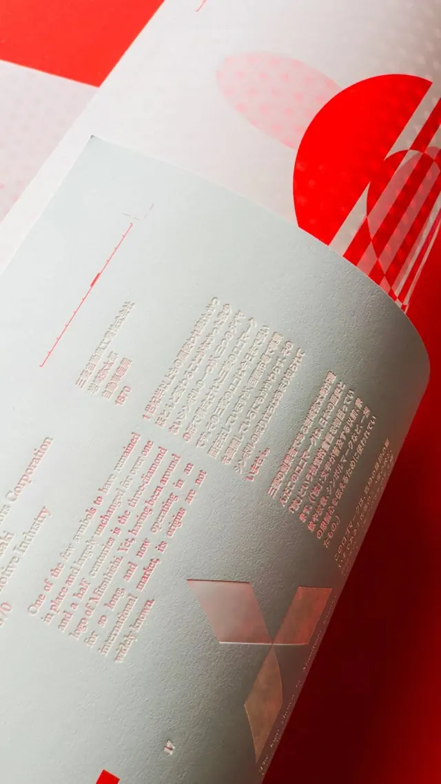
An editorial publication spread combining soft geometric forms in cream and red with dense typographic text in warm, earthy tones.
Summary
An editorial publication spread combining soft geometric forms in cream and red with dense typographic text in warm, earthy tones.
Visual description
A printed page shot from above showing a curved light cream surface as the dominant field. A bold bright-red geometric form anchors the upper-left and middle-right areas: a large circular shape with geometric red rectangles creating a rhythmic visual accent. Text in small warm-toned sans-serif fills the center-left in organized columns, creating texture without distraction. Layered red accents include thin linear elements and additional color-blocked rectangles at the lower-right edge, establishing a visual path from top to bottom. Shadows visible on the cream ground suggest dimensional height and material quality, reinforcing the print-design context.
Key takeaway
The color-blocking strategy: just two accent colors (bright red + subtle cream tones) orchestrate the entire visual hierarchy without overwhelm. The curved form language softens what could be rigid geometry, creating movement. The asymmetric placement of type and image forces eye travel across the page, preventing static composition.
Reuse notes
Strong for magazine, journal, or book design where editorial rhythm matters. Works for luxury packaging, high-end print collateral, or institutional publication systems. The warm earthy palette pairs well with fine art, cultural, or heritage-focused brands. The curved/geometric accent pattern repeats easily across multiple pages without feeling formulaic.
More like this



Keep what you find
A free account saves references to boards and can send you a weekly email of picks based on what you save.
To see every result, go Pro.