Preview image. Unlock full-res
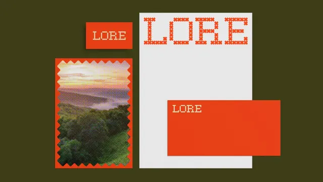
LORE's branding pairs minimalist red blocks with textured landscape photography and oversized pixelated letterforms, unifying a print-forward identity.
Summary
LORE's editorial identity orchestrates color-blocking, landscape photography, and retro pixelated letterforms into a cohesive print system balancing restraint and visual presence.
Visual description
A composition of branded elements arranged on an olive-green background. Left side shows a small red label containing white condensed sans-serif "LORE" above a tall vertical rectangular photograph of a mountainous landscape with sky gradation, framed by a jagged decorative border rendered in the same red. Right side features a large white panel with oversized pixelated letters spelling "LORE" in bright orange-red, using a pixel/dot-matrix typeface reminiscent of retro digital displays. The overall palette relies on red-orange, white, and earth tones with the background olive providing cohesion.
Key takeaway
The jagged border technique elevates a simple landscape photograph from ordinary to distinctive. The pixelated type treatment reads both contemporary and nostalgic, differentiating the wordmark from conventional typography. The strategic use of white space keeps the design from feeling cluttered despite multiple elements.
Reuse notes
Well-suited for editorial brands, publishing, or lifestyle media seeking a vintage-forward identity. The jagged borders pair effectively with organic imagery. The pixelated type can be overused; deploy it as an accent rather than primary wordmark. The color scheme works on both print and digital; ensure sufficient contrast for smaller applications.
More like this




Keep what you find
A free account saves references to boards and can send you a weekly email of picks based on what you save.
To see every result, go Pro.