Preview image. Unlock full-res
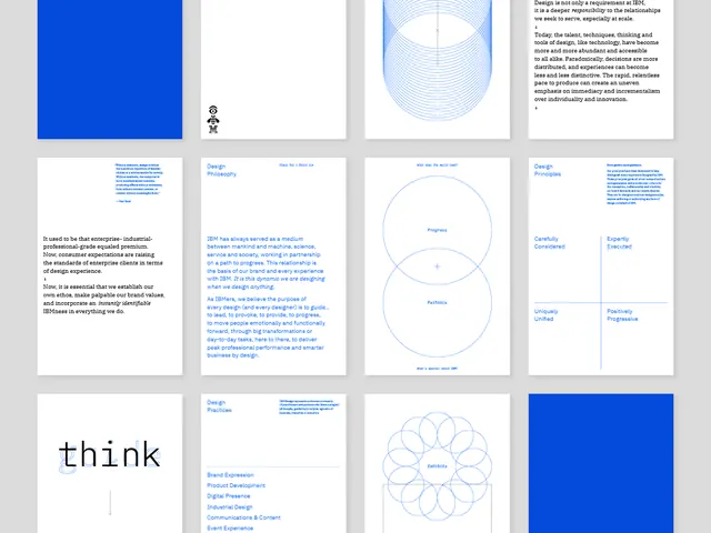
Comprehensive IBM brand-system presentation showing design philosophy, geometric diagrams, modular grid layouts, and corporate type specifications in monochromatic blue and white.
Summary
A comprehensive design system presentation for IBM, combining minimalist principles, geometric line-art diagrams, philosophy statements, and modular layout grids in corporate blue and white.
Visual description
A grid of twelve cards (4x3) on a light gray background. Top row: a bold primary blue solid, white space with a small icon mark, a radial line-art oval diagram. Remaining cards alternate between text-heavy philosophy blocks (bold sans-serif subheading in blue, justified body copy in black) and geometric diagrams (nested circles, flowing curves, constellation-like dot patterns). Typography is uniform sans-serif throughout. A small "think" wordmark appears in the bottom-left. The card borders and layout create a rigid modular structure. Color is restrained: bright cobalt blue accents on a neutral palette of white, light gray, and charcoal text.
Key takeaway
The use of minimal geometric line-art to express design concepts (progress, relationships, ecosystem) without literal illustration. The rigid card grid enforces consistency while each card plays a distinct role (philosophy, diagram, brand practice). The bright blue accent color is used sparingly, drawing the eye to key information. The sans-serif type treatment is clean and corporate without being sterile.
Reuse notes
Ideal for B2B, consulting, and enterprise-software brands. This system works well when you need to balance narrative (philosophy) with visual metaphor (diagrams). The monochromatic palette with one accent color is timeless and scales across presentations, packaging, and digital. Use as a reference for modular design-system layouts and restrained geometric iconography.
More like this



Keep what you find
A free account saves references to boards and can send you a weekly email of picks based on what you save.
To see every result, go Pro.