Preview image. Unlock full-res
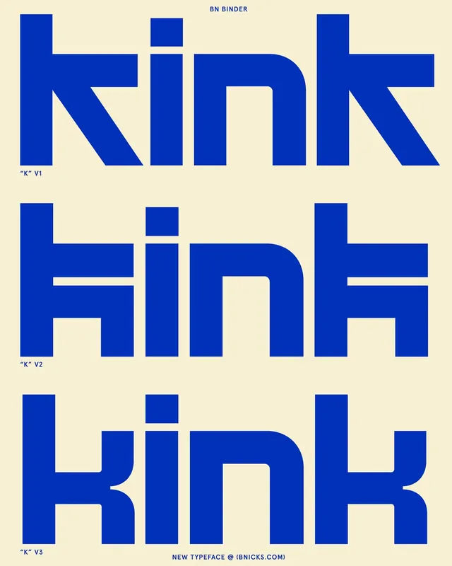
Three iterations of a bold geometric sans-serif typeface showing letter-form evolution and structural experimentation.
Summary
Three iterations of a bold geometric sans-serif typeface showing letter-form evolution and structural experimentation.
Visual description
A cream background displays three stacked typographic studies labeled V1, V2, and V3, each spelling out the same letters in deep royal blue all-caps. The header reads "BN BINDER" and "NEW TYPEFACE @ (BNICKS.COM)" at foot. V1 presents condensed, strictly geometric characters with diagonal stroke cuts in the K. V2 redraws with bolder horizontals and nested rectangular spaces within the P and K. V3 softens the terminals and curves the P's bowl while maintaining the geometric weight. Each version occupies the full width, using careful negative space between letters to showcase the evolving design decisions. The rhythm of repetition emphasizes the differences in stroke weight, proportion, and counter-space.
Key takeaway
Using repetition and clear labeling (V1, V2, V3) to communicate design iteration as a storytelling tool. The restrained two-color palette (navy and cream) lets the letterforms themselves carry all visual weight. The way geometric sans-serifs can be explored through subtle shifts in proportions, curves, and counter-spaces without abandoning structure.
Reuse notes
Excellent template for any type-design presentation, system documentation, or design iteration showcase. Works for font foundry portfolios, educational materials on typography, or editorial features on design process. The large scale ensures legibility even at print reductions. Pair with minimal prose captions or process notes.
More like this
Keep what you find
A free account saves references to boards and can send you a weekly email of picks based on what you save.
To see every result, go Pro.