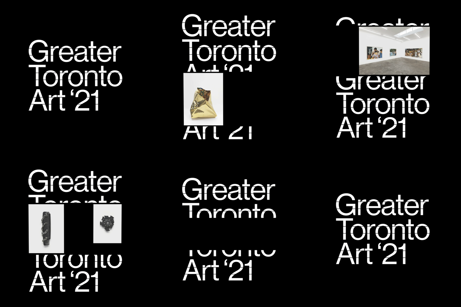
Preview image. Unlock full-res
Three-line stacked typography spelling out 'Greater Toronto Art 21' in clean sans-serif white on pure black.
Summary
Three-line stacked typography spelling out 'Greater Toronto Art 21' in clean sans-serif white on pure black.
Visual description
The text is set in an undecorated geometric sans-serif, centered vertically on the frame. 'Greater' and 'Art 21' occupy their own lines with full cap letters. A horizontal bar sits directly beneath 'Toronto' as a typographic accent. All letters use consistent stroke weight and width for visual unity. The pure black background and white letterforms create extreme contrast. Letter spacing is generous and optical, suggesting intentional typographic composition rather than default kerning.
Key takeaway
Pairing sans-serif typography with a typographic rule as visual punctuation adds sophistication without ornamentation. The stacked layout creates a compact, memorable symbol suitable for event signage. Maximum contrast and clean geometry ensure impact at any display scale. The horizontal bar grounds the composition and separates the organization name from the year.
Reuse notes
Strong model for arts organization, cultural institution, or event branding where boldness and clarity are priorities. Works especially well for print collateral, signage, and digital headers. Effective for nonprofits or galleries where minimalism conveys curatorial taste. The geometric sans-serif and high contrast appeal to contemporary and experimental arts contexts.
More like this





Keep what you find
A free account saves references to boards and can send you a weekly email of picks based on what you save.
To see every result, go Pro.