Preview image. Unlock full-res
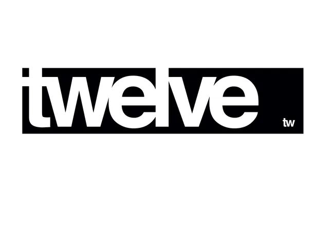
Bold, high-contrast wordmark for 'Twelve' in a geometric sans-serif, white letterforms on solid black background with minimal serif ornamentation.
Summary
Bold, high-contrast wordmark for 'Twelve' in a geometric sans-serif, white letterforms on solid black background with minimal serif ornamentation.
Visual description
The word "Twelve" rendered in large, confident white uppercase letters on a pure black horizontal band, centered in a light gray field. The typeface is geometric and sans-serif with even stroke weight and open letterforms that maximize the contrast between the solid black bar and the white space inside and around the letters. A small squared dot (or period) sits above the capital T, suggesting a design mark or company signature. The composition is extremely spare, relying entirely on typographic weight and the black-white value shift for impact.
Key takeaway
The power of extreme value contrast in a wordmark design. The pairing of thick geometric sans-serif with a dark horizontal frame that contains it, directing the eye without extra ornament. Using a minimal serif mark (the dot) to anchor a modern sans-serif wordmark and suggest precision or methodology.
Reuse notes
Strong for media, tech, or B2B brands that need authority and confidence in a single mark. The high contrast reads well at any scale and in black and white contexts. The simplicity means it travels well across digital and print applications without loss of clarity. Best suited to brands that emphasize clarity, directness, and modern sensibility.