Preview image. Unlock full-res
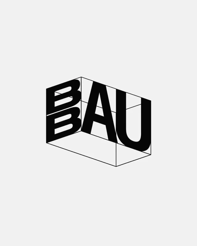
Bold isometric logotype with the letters BAU rendered as three-dimensional blocks in pure black and white, using constructivist geometry and axonometric perspective.
Summary
BAU is a geometric isometric logotype spelling three capitals as interlocking three-dimensional blocks in pure black against light gray, anchored in axonometric perspective.
Visual description
Centered letterform occupying most of canvas. Three capitals BAU rendered as solid black geometric blocks with clean white interior spaces cutting through each letter. The perspective is consistent isometric, with visible top and side planes creating dimensionality; white dividing lines show the 3D construction and inner letterforms. B has horizontal striations visible through its geometry; A and U are simpler block forms. Light gray background. Uniform stroke weight throughout, reinforcing technical precision. No serifs, shadows, or decorative details.
Key takeaway
Isometric perspective applied to letterforms creates memorable, sculptural presence; the monochromatic approach makes the geometry the star; interior cutouts add visual complexity without added lines; axonometric rendering feels architectural and authoritative; the construct reads as modern brutalism applied to typography.
Reuse notes
Excellent for architecture, construction, design education, or any brand seeking to project structural thinking and rigor. Works in monochrome contexts (signage, embossing, letterpress). Avoid using if the brand needs warmth or approachability; this mark is intentionally austere and formal.