Preview image. Unlock full-res
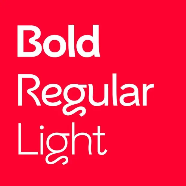
Bold white sans-serif typeface demonstrating three weights (Bold, Regular, Light) stacked vertically against a bright red background.
Summary
A color-bold typographic specimen displaying a clean sans-serif family in three weights stacked vertically, emphasizing contrast through color and visual weight.
Visual description
The composition is fundamentally simple: three lines of all-caps white sans-serif type stacked vertically and left-aligned on a bright red square background. The top line reads "Bold" in the heaviest weight, the middle reads "Regular" in medium weight, and the bottom reads "Light" in the thinnest weight. The typeface is geometric and contemporary, with consistent letterforms across weights. The white type creates maximum contrast against the red, making the hierarchy of visual weight immediately legible. No additional elements or spacing breaks.
Key takeaway
The weight-differentiated stacking creates hierarchy through visual contrast alone, with no labels or annotations needed. The color choice amplifies the impact of the type, turning the specimen into a striking graphic asset rather than a quiet reference page. Showing three weights in one lockup demonstrates versatility efficiently.
Reuse notes
Ideal for contemporary tech, design, or media brand guidelines needing an assertive, confident tone. Works as a poster, social-media graphic, or reference asset. The bright red and white reads masculine or energetic; pair with softer colors or secondary type for balance. Effective for font foundry or type design promotion.
More like this



Keep what you find
A free account saves references to boards and can send you a weekly email of picks based on what you save.
To see every result, go Pro.