Preview image. Unlock full-res
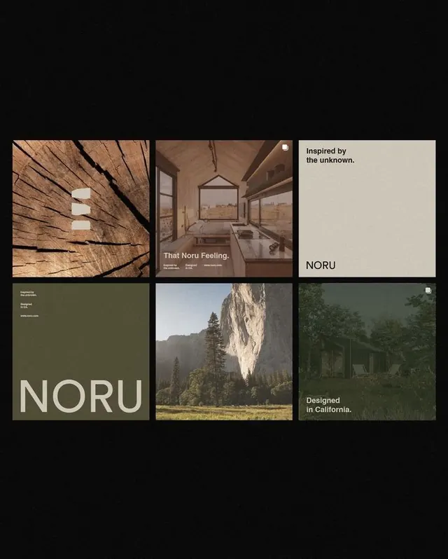
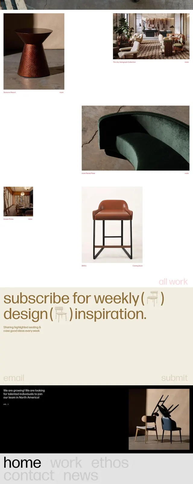
Editorial spread arranged in a modular grid of alternating photographic panels and solid color blocks, set in warm earthy and neutral tones.
Summary
Editorial spread arranged in a modular grid of alternating photographic panels and solid color blocks, set in warm earthy and neutral tones.
Visual description
Layout divides into roughly equal rectangular units (grid system). Dark blocks, photographic textures (muted colors, architectural or landscape subjects), and solid khaki or tan panels alternate across the composition. Text is set in a clean sans-serif, usually positioned with generous margins within the colored blocks or overlaid with restraint. The palette stays within warm browns, grays, and off-whites, avoiding contrast; photographic elements read as natural textures rather than high-saturation imagery. Overall rhythm is calm and measured.
Key takeaway
The grid-based modularity that lets different content types (image, text, solid color) coexist without visual chaos. The restraint in color, keeping the palette warm but muted so photographic elements feel integrated rather than inserted. The spacing strategy that gives breathing room around text without feeling airy.
Reuse notes
Excellent for editorial design, lifestyle branding, architecture or design firm portfolios, and slow-paced narrative content. Works well in print and digital contexts. The organic palette reads as crafted and thoughtful, not corporate. Pair with photography that has natural, subdued tones rather than bright or saturated imagery.
More like this





Keep what you find
A free account saves references to boards and can send you a weekly email of picks based on what you save.
To see every result, go Pro.