Preview image. Unlock full-res
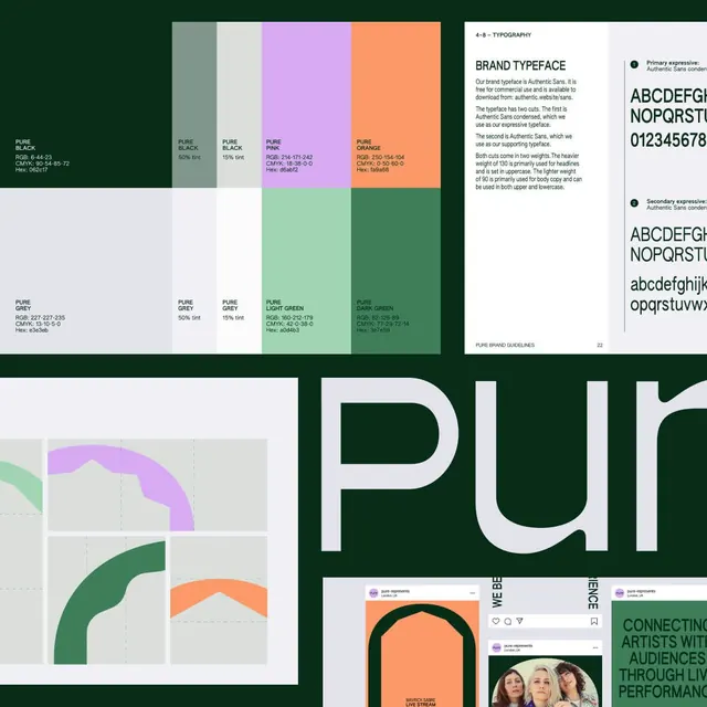
A structured brand guidelines page documenting a color palette of deep green, pink, peach, and cream with hex and CMYK values, plus two-weight Authentic Sans typeface specifications.
Summary
A structured brand guidelines page for "PURE" showing a complementary color system (deep forest green, dusty pink, peachy orange, cream, grey) with precise hex and CMYK codes, paired with two-weight Authentic Sans typeface documentation.
Visual description
The top half displays a color palette in a 5x2 grid: swatches labeled PURE BLACK, PURE GREY (50% and 15% tints), PURE PINK, PURE ORANGE, and PURE LIGHT GREEN / PURE DARK GREEN, each with hex and CMYK values. The bottom left shows construction guides for organic curved shapes in pink and green. The right panel details "BRAND TYPEFACE": Authentic Sans in two cuts (condensed and regular weights), with alphabet samples and weight distribution notes. Deep green background frames the white and cream layout.
Key takeaway
Clean, scannable swatch layout with color codes front and center for implementation. The typography panel uses comparative weight samples and notes on optical sizing (heavier weights for headlines, lighter for body) rather than just showing letterforms.
Reuse notes
Effective template for any brand with a moderate palette (4-6 colors). The grid-based layout and explicit CMYK/hex pairing works for print and digital handoff. Authentic Sans is a good reference for contemporary sans choices in luxury or organic contexts.
More like this




Keep what you find
A free account saves references to boards and can send you a weekly email of picks based on what you save.
To see every result, go Pro.