Preview image. Unlock full-res
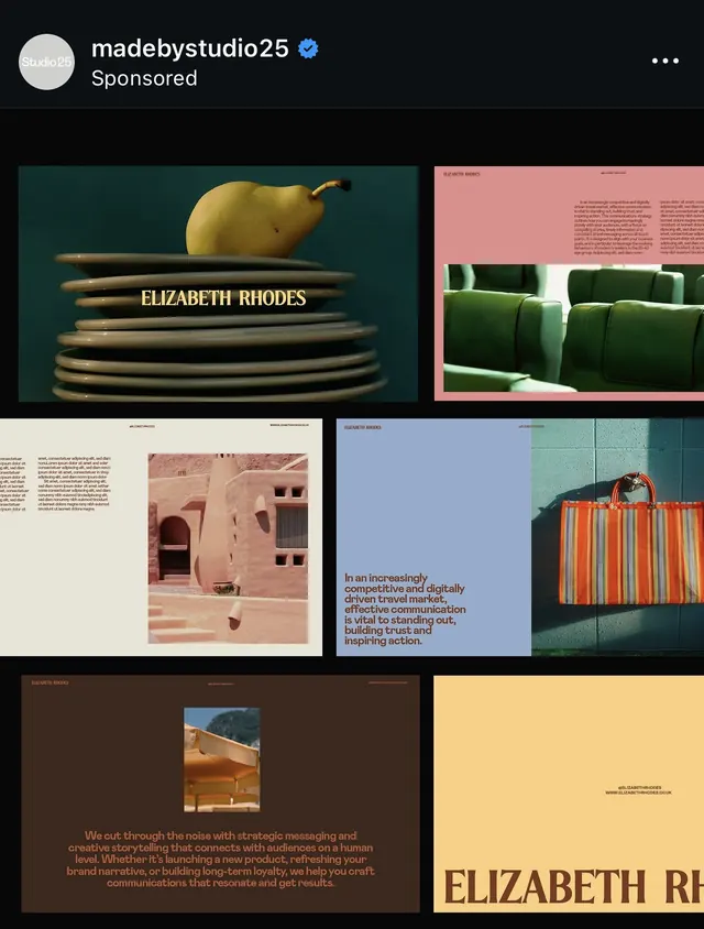
Editorial portfolio grid layering textured photography, muted greens and creams, and refined typography across a modular layout.
Summary
Editorial portfolio grid pairing soft landscape photography, textured paper mockups, and bold typography in earthy greens and warm neutrals.
Visual description
A six-panel editorial layout featuring stacked imagery and type. Top left shows a pear on stacked cream-and-tan papers with serif text reading "ELIZABETH RHODES." Top right displays open book spreads with deep sage green and rose tones on a blush background. Middle row mixes a minimalist cover design (rose interior with small photograph), a pink wall installation, and a burnt-orange striped wall or structure, each with fragmentary text overlays. Bottom panel spans full width with a mountain landscape photograph in warm, diffused tones beside a pale butter-yellow panel with right-aligned type. All type is refined sans-serif in dark or warm brown, set in generous margins. The overall spacing emphasizes air and silence between elements, allowing each image and text block to breathe independently.
Key takeaway
The deliberate mixing of photography, product mockups, and architectural detail across one modular grid, unified by a restricted color story. The principle of staggered text placement (some left, some right-aligned, some centered) creating rhythm without visual chaos. Generous negative space between panels prevents the multi-image layout from feeling crowded.
Reuse notes
Ideal reference for portfolio or lifestyle brand identity projects needing texture and warmth without excess ornament. Works well for agencies, design studios, or editorial brands targeting sophisticated, design-literate audiences. The muted palette reads as authentic and contemporary; scaling the color slightly hotter or darker shifts the mood to luxury or minimalist-commercial.
More like this

Keep what you find
A free account saves references to boards and can send you a weekly email of picks based on what you save.
To see every result, go Pro.