Preview image. Unlock full-res
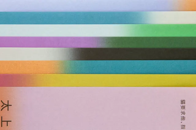
Horizontal color-palette specimen showing eight soft-to-muted gradient swatches spanning cool purples through warm yellows and teals, with Japanese text baseline.
Summary
A minimal color-palette specimen displayed as eight horizontal gradient swatches progressing from cool purples and blues through warm yellows and returning to cool teals.
Visual description
Eight equal-height horizontal bands of color spanning the full width of the frame. Reading left to right: pale purple-grey, soft yellow-green, pale blue-grey, mint green, warmer mustard-yellow, pale pink, deep teal, and soft olive-green. The transitions are smooth and the palette sits in a cool-to-warm-to-cool progression that creates harmonic balance. Faint Japanese characters appear centered at the bottom in small caps, suggesting a formal presentation or branding specification document. No decorative elements; the focus is purely on the color relationships.
Key takeaway
The horizontal gradient palette as a presentation format. The smooth transitions and the cool-warm-cool sequencing create visual harmony despite muted saturation. This approach works well for showing restrained, contemporary color systems that read calm and sophisticated rather than playful.
Reuse notes
Excellent reference for soft, contemporary palette systems in print, packaging, and web design. The muted saturation pairs well with minimal typography and editorial design. The horizontal strip format is easy to reference and scale. Japanese text suggests this may be from a design specification or branding manual; consider using a similar formal presentation for complex multi-color systems.
More like this


Keep what you find
A free account saves references to boards and can send you a weekly email of picks based on what you save.
To see every result, go Pro.