Preview image. Unlock full-res
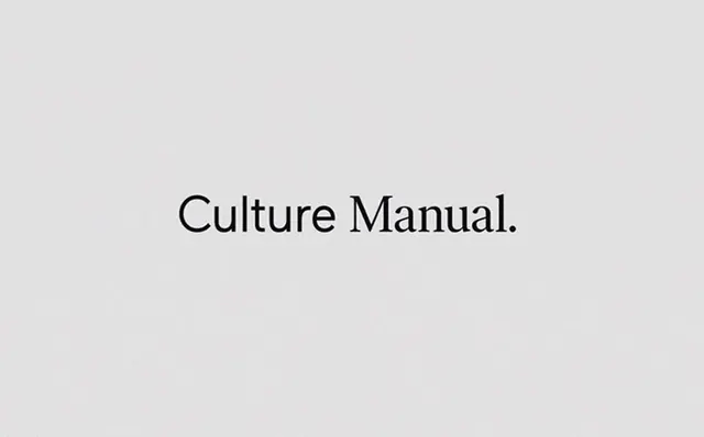
Centered serif wordmark on a light gray ground, using extreme negative space to establish calm, editorial authority.
Summary
A centered serif wordmark—"Culture Manual."—floating in vast negative space, establishing quiet brand authority through restraint and typographic grace.
Visual description
A single serif word pair in a mid-gray to charcoal weight sits centered against a light gray ground. The typeface is traditional, with serifs and high contrast strokes. The composition employs extreme whitespace above and below, letting the four-word mark breathe. No color, pattern, or secondary elements compete. The overall effect reads as a title page or brand guideline cover, where typography alone carries the design weight.
Key takeaway
Restraint as a statement. Type-centric branding that drops visual clutter entirely and lets letterforms do the work. The centered axis + generous padding is a timeless template for editorial or premium identities.
Reuse notes
Ideal for publishing, media, or corporate work where authority comes from simplicity rather than decoration. Fits brand manual covers, title cards, or any context where understated elegance signals quality. The serif choice adds formality; swap to a minimal sans for contemporary tech brands.
More like this




Keep what you find
A free account saves references to boards and can send you a weekly email of picks based on what you save.
To see every result, go Pro.