Preview image. Unlock full-res
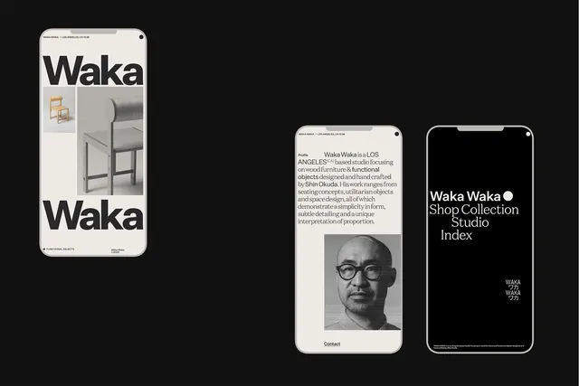
Three mobile interface screens showing Waka Waka, a Los Angeles furniture design studio, with clean black/white layout, serif body text, and product imagery on off-white cards.
Summary
Mobile design system for Waka Waka studio, featuring crisp black sans-serif headlines over off-white backgrounds, serif body text, product photos, and a designer portrait on separate tab screens.
Visual description
Three iPhone mockups displayed in a row against a black background. The left screen shows a large-scale wordmark 'Waka Waka' in bold sans-serif at top, with product imagery (wooden chair, rolled chair detail, chair profile) arranged vertically below on an off-white card. The center screen displays a profile section with dense body copy in a serif typeface, followed by a black and white portrait photograph of a man wearing glasses, and a 'Contact' link at the bottom. The right screen is predominantly black with the inverted wordmark 'Waka Waka' in white and the tagline 'Shop Collection Studio Index' in thin serif below, with small Japanese characters (ワカ) at the bottom. Top notch is consistent across all three, with small branding text 'WAKA WAKA' above the status icons.
Key takeaway
The serif/sans-serif pairing (big headlines in sans, body copy in refined serif) creates hierarchy and reads as editorial without feeling academic. The color strategy is ruthlessly simple: black type on off-white with black screens for navigation, eliminating all noise. Product imagery is treated with equal visual weight as type, each occupying distinct zones, so photography doesn't compete with text. The Japanese characters add cultural specificity without clutter.
Reuse notes
Ideal for design studios, luxury goods, or portfolio-heavy brands targeting design-literate audiences. The minimal color palette limits customization but guarantees consistency at any screen size. The serif body copy works best when there is genuinely good, interesting text to justify its presence; avoid using it as filler. The black/off-white split screen technique helps navigation feel intentional, not accidental.
More like this







Keep what you find
A free account saves references to boards and can send you a weekly email of picks based on what you save.
To see every result, go Pro.