Preview image. Unlock full-res
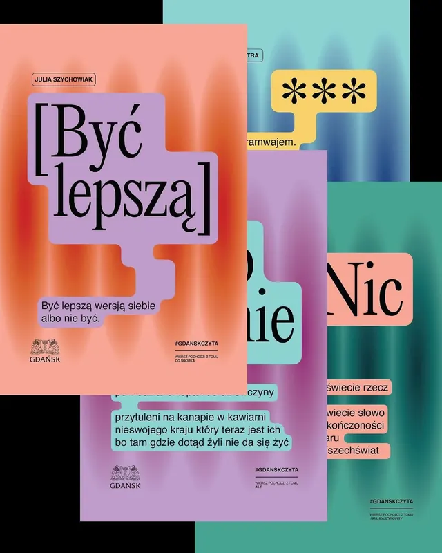
Polish-language typographic poster layering soft pastel color blocks in coral, pink, teal, and mint with bold display type and irregular cutout shapes.
Summary
Polish-language typographic poster layering soft pastel color blocks in coral, pink, teal, and mint with bold display type and irregular cutout shapes.
Visual description
Large-scale display type (serif and sans-serif mix) fills asymmetric, overlapping rectangular color fields. Dominant text appears to be motivational or conceptual (Polish language). Soft coral and peachy tones dominate the left and upper areas; cooler teals and mints occupy the right and lower sections. Irregular rectangular "cutouts" in pastel shades layer across a muted green-to-blue gradient background, creating depth and spatial illusion. Supporting text in smaller weights sits within color blocks. A faint logo or institution mark appears in corners. The overall effect is dreamlike and contemporary, balancing vibrant pastel blocks with negative space and soft form edges.
Key takeaway
Pastel color blocking creates a gentle but visually organized layout. Overlapping irregular rectangles (without rounded corners) read as modern and editorial rather than playful. The mix of serif and sans-serif type within a geometric field creates visual contrast without visual noise. Negative space and light backgrounds prevent the design from feeling cluttered despite the dense typography.
Reuse notes
Effective for editorial covers, institutional posters, publishing identities, and self-help/wellness branding. Soft pastel palettes work well for introspective or aspirational messaging. The layered rectangular approach works less well for content-dense layouts; prioritize clear hierarchy and generous leading.
More like this

Keep what you find
A free account saves references to boards and can send you a weekly email of picks based on what you save.
To see every result, go Pro.