Preview image. Unlock full-res
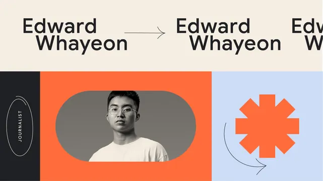
Modular portfolio identity specimen for Edward Whayeon: split-panel layout pairing a portrait in burnt-orange frame against a pale blue geometric shape, united by bold sans-serif logotype and arrow directional element.
Summary
Personal portfolio branding system showing Edward Whayeon's name repeated in a sans-serif display face across modular panels: a portrait in burnt-orange on the left, a geometric starburst mark on pale blue on the right, connected by an arrow indicating progression.
Visual description
Horizontal tri-panel layout. Left panel: dark vertical sidebar with logotype "E WHAYEON" in narrow serif caps. Center: burnt-orange rectangle containing a head-and-shoulders portrait photo cropped in a soft oval shape. Right: pale periwinkle-blue ground with a geometric starburst mark in matching burnt-orange, plus a subtle curved arrow directing right. Top: repeated "Edward Whayeon" text across the header in sans-serif at different scales. The color story is strictly complementary: burnt-orange and pale blue with beige-gray and dark charcoal as neutrals.
Key takeaway
The complementary color blocking between the portrait section and geometric section creates visual interest while maintaining a clean, structured feel. The arrow as a directional connector adds forward motion to a static layout. The starburst or asterisk mark is a flexible geometric element that can work across applications. The repetition of the name at different scales shows versatility of a single typeface.
Reuse notes
Strong model for personal branding or portfolio systems where the designer/artist is the subject. The split warm-cool layout is memorable and works across business cards, websites, and printed materials. The narrow vertical sidebar is good for contact info or metadata. Works best in media, photography, or creative fields where showcasing a face is credible.
More like this



Keep what you find
A free account saves references to boards and can send you a weekly email of picks based on what you save.
To see every result, go Pro.