Preview image. Unlock full-res
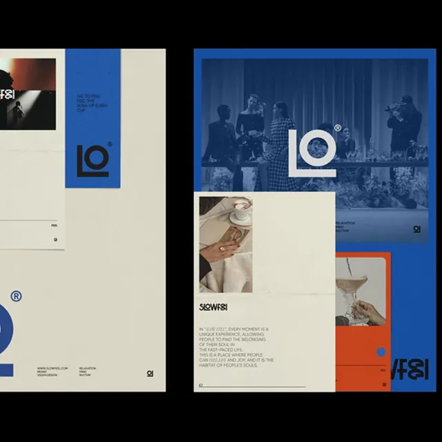
Editorial branding featuring a bold blue square logo and a modular system mixing cream, blue, and deep navy with geometric blocks and photography.
Summary
Editorial branding featuring a bold blue square logo and a modular system mixing cream, blue, and deep navy with geometric blocks and photography.
Visual description
A two-page spread showing an identity system anchored by a clean square logo in blue with a centered circle. The left page is dominated by cream and beige with a blue vertical accent stripe, a small photograph, and the logo in the bottom corner. The right page uses a deep blue background with a large photograph of people in a vertical curtained space, a white centered logo, a cream block in the middle third containing lifestyle photography and body text, and an orange-red accent stripe at the bottom right. Typography is clean sans-serif in white and cream on blue. The system balances asymmetry with a clear grid structure, emphasizing breathing room and photo visibility.
Key takeaway
The modular color-blocking system that lets the same logo and type system work across contrasting backgrounds. The strategic use of one accent color (orange-red) punching against blue and cream. How photography is integrated as both a full bleed element and a smaller inset within type-heavy areas.
Reuse notes
Strong foundation for media, publishing, or editorial-focused brands needing both print and digital applications. The blue-cream-orange palette is distinctive but transferable; the grid discipline allows flexibility without chaos. Works well for lifestyle or culture brands.
More like this





Keep what you find
A free account saves references to boards and can send you a weekly email of picks based on what you save.
To see every result, go Pro.