Preview image. Unlock full-res
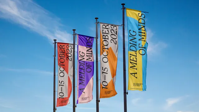
Four vertical festival banners in red, purple, orange and yellow flying from black poles against a clear blue sky.
More like this
See all
Summary
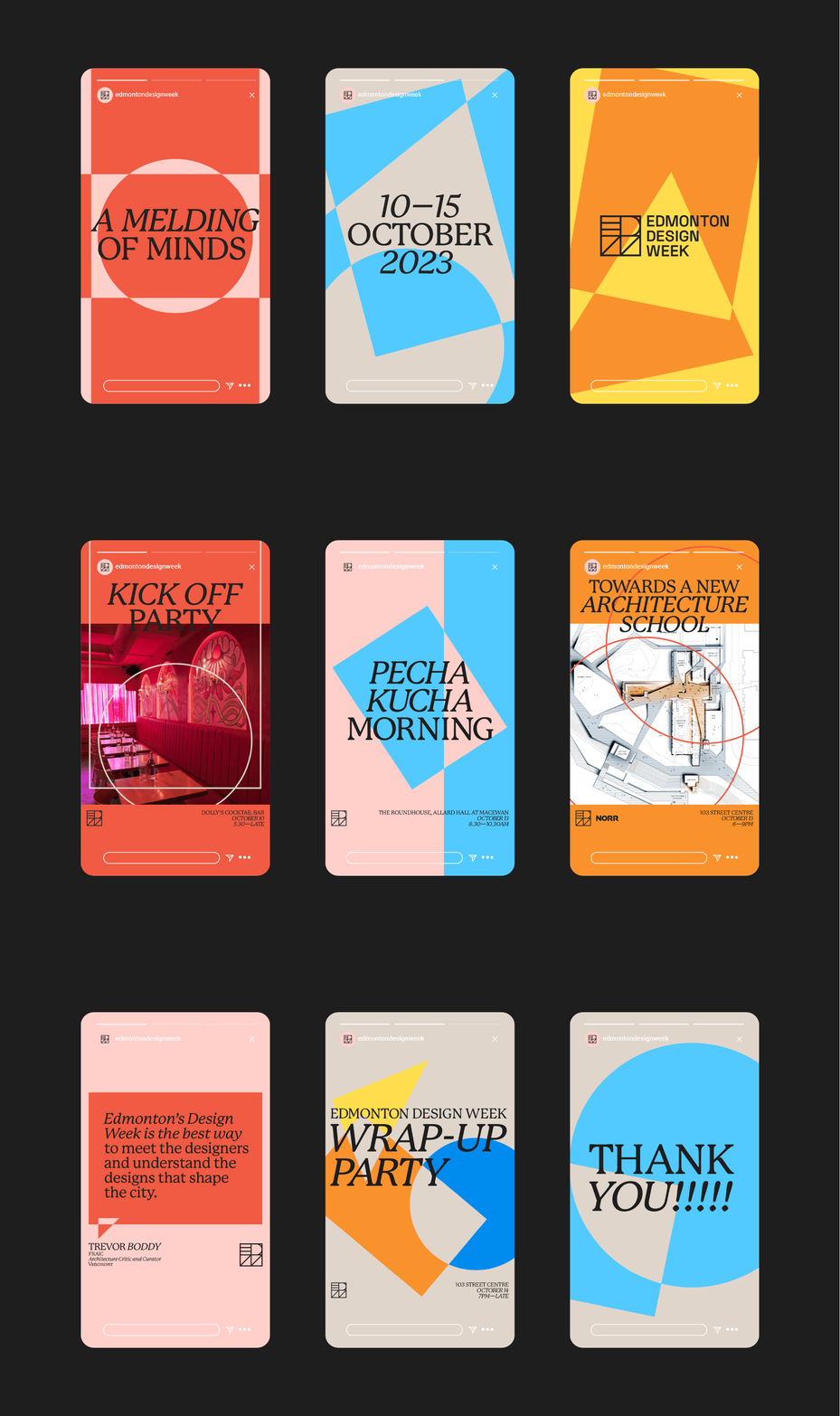
The festival identity as street banners, with the headline rotated to run down the length of each flag and a hard two-colour split doing all the shape work.
Visual description
Four narrow portrait banners hang from short cross-arms on black poles, stepping back into the frame from lower left to upper right against a bright blue sky with thin cirrus. Each flag is split into two flat colours by a curve or diagonal: red over pale stone, violet over pink, orange over stone, yellow over cyan. The type runs vertically, reading bottom to top, in a high-contrast display serif set in caps. Two flags read "A MELDING OF MINDS" across two stacked lines; the other two read "10 to 15 OCTOBER 2023". At the foot of each banner sits the square Edmonton Design Week monogram with the name set in three short lines beside it, and below that the url edmontondesignweek.com. The fabric ripples slightly, breaking the colour edges. No photography or illustration appears on the flags.
Key takeaway
Rotating a single caps serif line to fill the full drop of a banner removes the need for any other graphic element. Splitting each flag into two flat fields on a curve means one artwork can be recoloured endlessly and still look deliberate.
Reuse notes
Good for civic, festival and campus wayfinding where banners must read from a moving car. Vertical type limits you to short headlines and dates. The two-colour split relies on both colours being reasonably saturated; a pale-on-pale pairing would vanish against sky.