Preview image. Unlock full-res
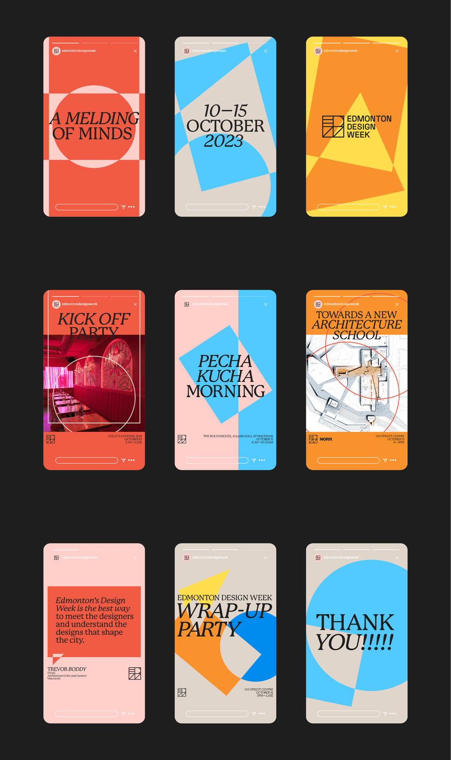
Three phone screens cycling through nine flat, geometric social story templates for a design festival identity.
More like this
See all
Summary
Three vertical phone screens sit side by side on a charcoal field and swap through nine social story layouts, showing a festival identity as a template system rather than a single poster.
Visual description
The backdrop is a flat near-black field. Three rounded phone frames are evenly spaced across it, each filled edge to edge by a story graphic complete with the platform chrome: a segmented progress bar, a small avatar and handle at top left, a close cross at top right, and a message field at the base. Every story is built from two or three flat colours drawn from a tight set of red orange, sky blue, marigold, warm sand and blush pink, cut by oversized geometric shapes such as full circles, quarter round wedges, tilted squares and checkerboard corners. Typography pairs a high contrast italic serif set large for the headline voice with a small condensed uppercase sans for dates, venues and credits. A compact square monogram built from ruled lines sits low on most screens next to the festival name stacked in four short lines. Over the loop the trio advances through the full run: an announcement card, a date card reading ten to fifteen October twenty twenty three, a wordmark card, a kick off party card carrying a magenta lit venue photograph inside a circle, a talks morning card, an architecture school card overlaying a technical line drawing on orange, a blush quote card with a small credit block beneath, a wrap up party card, and a closing thank you card set in the same italic serif.
Key takeaway
One shape kit and one type pairing carry nine visibly different posts. The circle, wedge and tilted square repeat at different scales and crops so each card reads as new artwork while the family stays obvious at thumbnail size. Showing the set in three phones at once sells the system, not the artwork.
Reuse notes
A strong reference for pitching a campaign as a template family: festivals, conferences, gallery seasons, anything that needs many posts in a short window. The italic serif does the heavy lifting, so it needs a genuinely characterful face to survive. The platform chrome dates the mockup, so redraw it if the presentation has to last.