Preview image. Unlock full-res
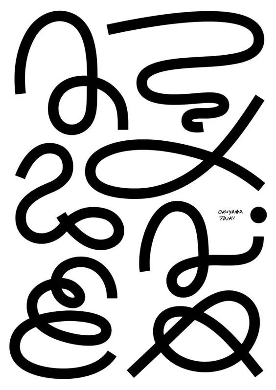
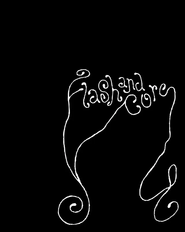
Minimalist handwritten wordmark traced in a single flowing line against solid black, combining organic calligraphic letterforms with whimsical flourishes.
Summary
A handwritten wordmark drawn in a single continuous line, balancing sophisticated calligraphic letterforms with playful upward-curling flourishes, set against a solid black field.
Visual description
Pure black background. In white line, a stylized word "Mash & Co" or similar three-word phrase rendered as if traced in one unbroken stroke. Tall, loosely-spaced letters with deliberate irregularity. The opening letter has a pronounced flourish that loops leftward. Ampersand sits mid-line, balanced. Letters taper and widen with hand-drawn variation. Below the text, two small spiral flourishes echo the ornamental gesture of the opener. The weight is consistent monoline (no thick-to-thin stroke variation), but the curves are organic and slightly uneven, echoing pen pressure.
Key takeaway
The single-line constraint forces discipline and elegance; every letterform earns its space. Flourishes at opening and footer create entry/exit points that guide the eye and add personality without clutter. Black-on-white reversal is immediately striking and scalable (logo, tattoo, embroidery, simple web SVG). The irregular hand-drawn quality reads as human and trustworthy despite the minimalism.
Reuse notes
Perfect for artisanal, craft-forward, or hospitality brands (food, design studios, independent makers). The legibility is strong at display sizes but can degrade at small scales if the line weight is too thin; test early. Works best on high-contrast backgrounds (black, white, or dark color). The ornamental flourishes are a signature move; don't simplify them away for digital applications. Avoid trying to make it symmetrical or "cleaner": the hand-drawn irregularity is the entire point.