Preview image. Unlock full-res
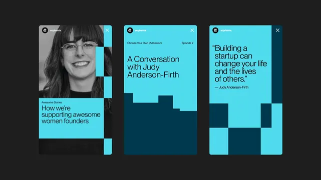
Three vertical mobile story screens for Euphemia, built from a cyan and deep-teal checkerboard motif with a black-and-white portrait and pull-quote.
More like this
See all

Summary
Three vertical story screens presented side by side on a near-black field, showing how the Euphemia identity flexes across editorial, podcast, and quote formats.
Visual description
Each screen carries the same header: a black circular mark holding a stacked three-bar glyph, the lowercase wordmark "euphemia" beside it, and a white close cross at the far right. Screen one is a black-and-white portrait of a smiling woman in glasses, overlaid at the lower third by a cyan block carrying the eyebrow "Awesome Stories" and a three-line headline, "How we're supporting awesome women founders." Screen two is solid cyan with a thin top row reading "Choose Your Own (Ad)venture" on the left and "Episode 2" on the right, then a large black headline, "A Conversation with Judy Anderson-Firth"; the bottom half is a stepped deep-teal silhouette that reads like a skyline or a bar chart. Screen three sets a large black pull-quote, "Building a startup can change your life and the lives of others," with an attribution rule and name below, over a lower field of cyan and deep-teal squares arranged as an irregular checkerboard. The type is a geometric sans with tight leading throughout, and every screen edge is squared off with blocky steps rather than curves.
Key takeaway
One two-color block system does all the work: the same square modules become a photo mask, a skyline, and a checkerboard footer depending on the screen. Keeping the header lockup and close cross identical across all three makes very different content read as one family.
Reuse notes
A good reference for a content-led brand that needs many social and in-app story templates from a small kit. The stepped block motif needs a strict pixel grid to avoid looking accidental, and the cyan-on-black contrast is doing the heavy lifting, so it will lose punch on a light background.
More like this


Keep what you find
A free account saves references to boards and can send you a weekly email of picks based on what you save.
To see every result, go Pro.