Preview image. Unlock full-res
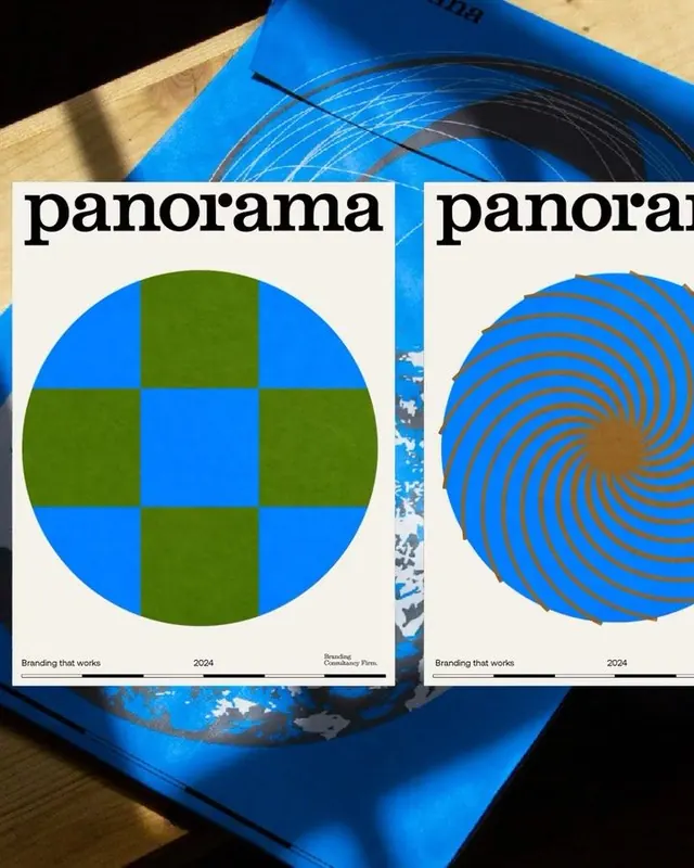
Two geometric branding sketches side-by-side: a checkerboard circle in olive and bright blue, and a spiral pattern in blue and tan.
Summary
Two geometric branding studies displayed as flat design posters with the word "panorama" in bold type, exploring regular grid and organic spiral motifs.
Visual description
Two square compositions printed on white card stock and photographed at an angle, revealing a textured blue background. Left study features a perfect circle divided into a checkerboard grid of eight alternating blue and olive squares, with "panorama" lettered boldly above. Right study shows a larger spiral pattern with concentric blue rings radiating outward from a warm tan center, with "panorama" and smaller text. Both cards include footer text stating "Branding that works" and "2024". A sans-serif typeface in black serves all typography, maintaining visual consistency between the two studies.
Key takeaway
The pairing of two distinct geometric approaches (regular division vs. organic spiral) demonstrates systematic exploration within a single color language. The square-format, printed-card presentation makes the concepts tactile and memorable. The centered, high-contrast glyphs are instantly readable.
Reuse notes
Ideal for showcasing design process or brand explorations in portfolio or pitch work. The geometric patterns work well as visual systems or icon foundations. The blue-olive-tan palette pairs well with modern, playful brand identities. This layout suits student work, agency case studies, or design-system documentation.
More like this


Keep what you find
A free account saves references to boards and can send you a weekly email of picks based on what you save.
To see every result, go Pro.